
With a rigorous attention to detail, hyper-sensitive approach to color, and a seemingly unlimited supply of popular culture references at his disposal, artist Andrew Brischler’s oeuvre demonstrates a refined, controlled, and evolving approach to artmaking that links the myriad of inspirations and experiences that have helped define his identity and his works. Primarily employing the medium of drawing, Brischler’s works offer a unique view into the inner workings of his ever-explorative mind. Both universal and deeply personal in nature, each series Brischler develops suggests a narrative arc that compels the viewer to contemplate its origin.
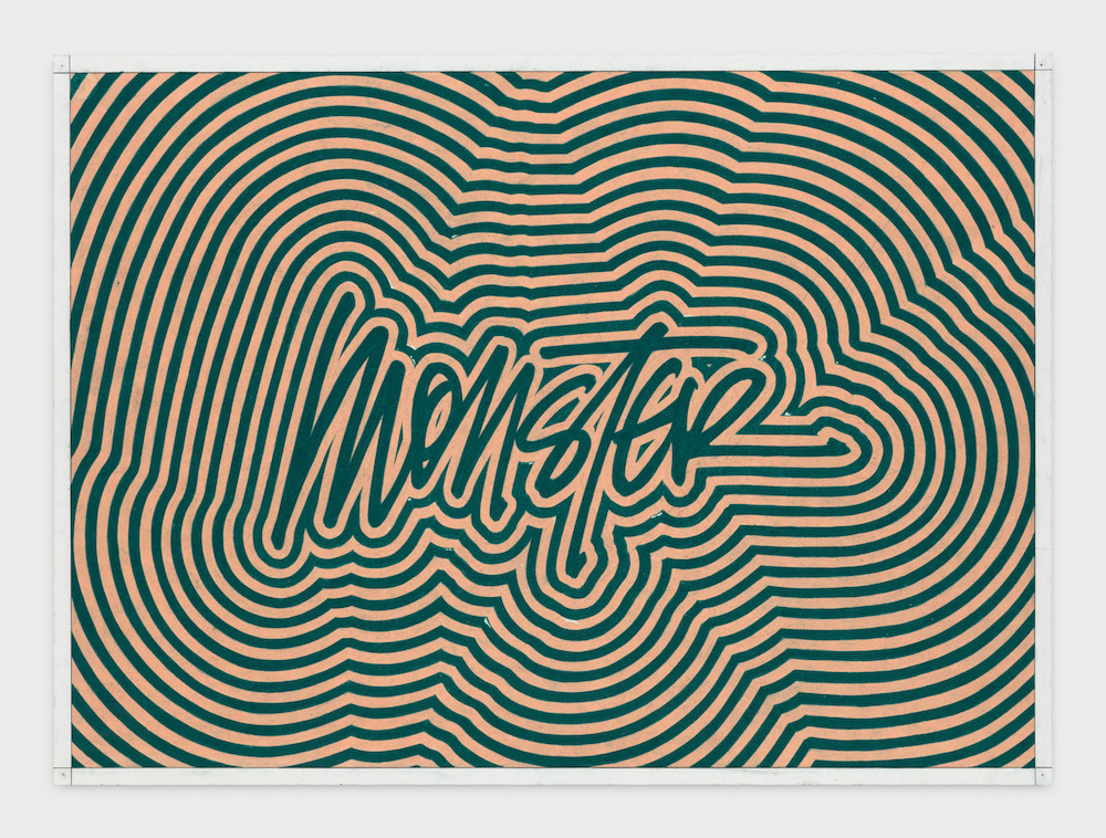
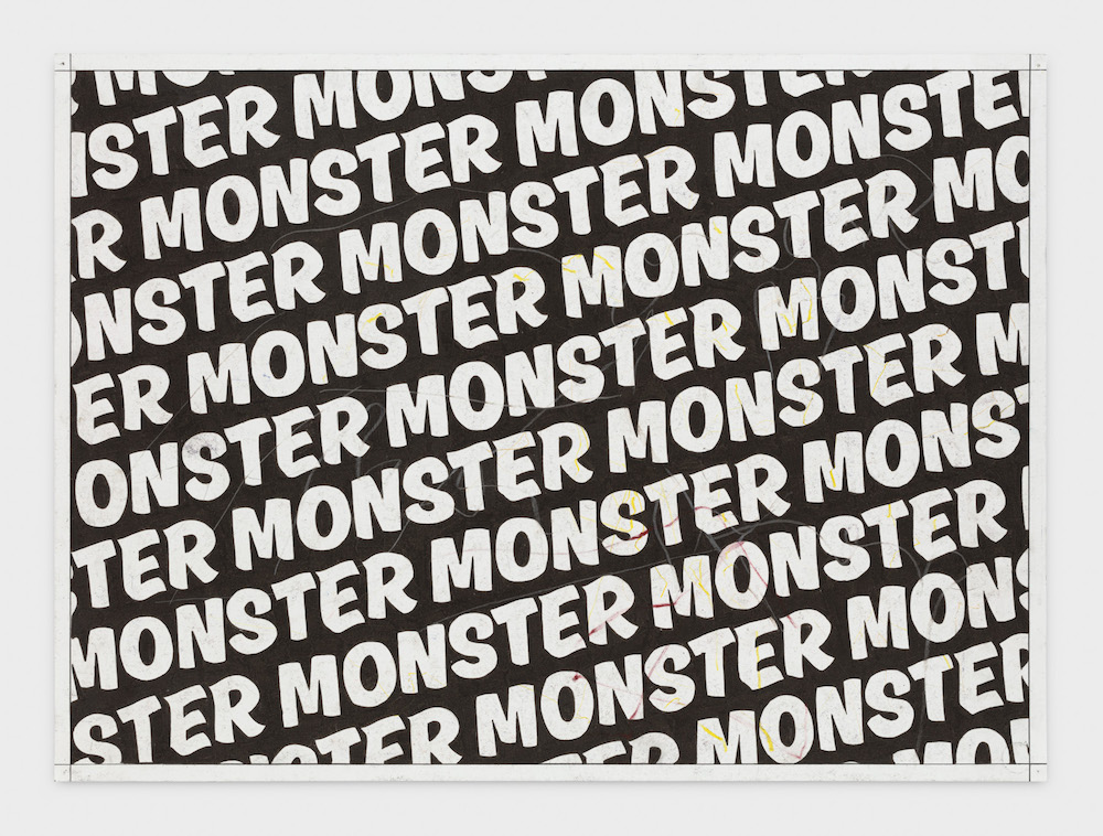 Andrew Brischler, “MONSTER (Charcoal Forever),” 2018-2019, colored pencil, marker,
and graphite on paper, 22 x 30 in, courtesy of the artist and GAVLAK, Los Angeles.
Andrew Brischler, “MONSTER (Charcoal Forever),” 2018-2019, colored pencil, marker,
and graphite on paper, 22 x 30 in, courtesy of the artist and GAVLAK, Los Angeles.
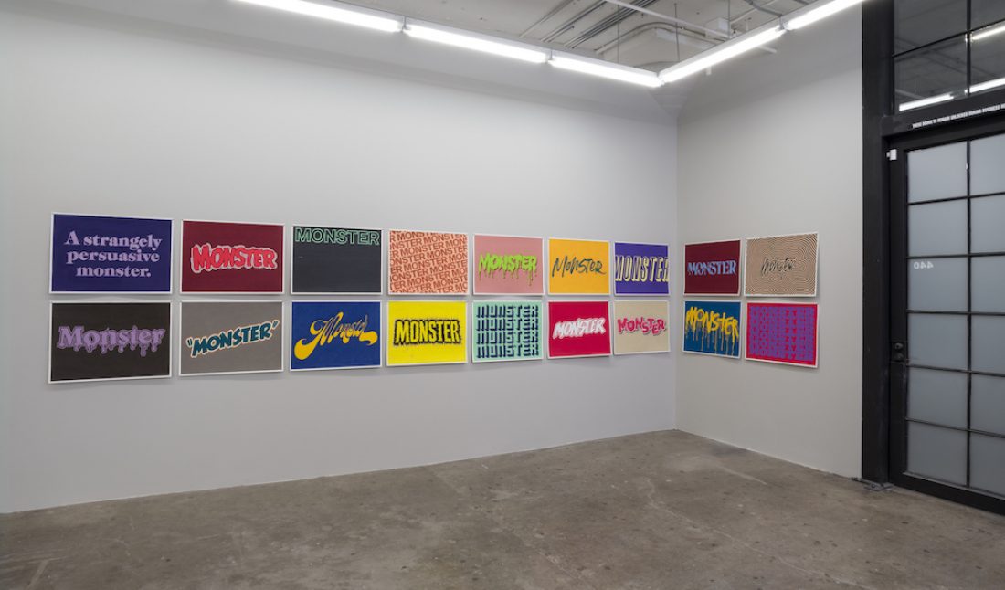
This summer, Brischler opened an exhibition of drawings from a series entitled “Monster” at Gavlak Gallery’s Los Angeles location. Packed with cultural, political, and personal references, these visually vibrant, technically astonishing works present a compelling iconography with layered meanings ripe for interpretation and conversation.
Whitewall spoke with Brischler on the occasion of his current solo exhibition at Gavlak, on view through August 14, 2021.
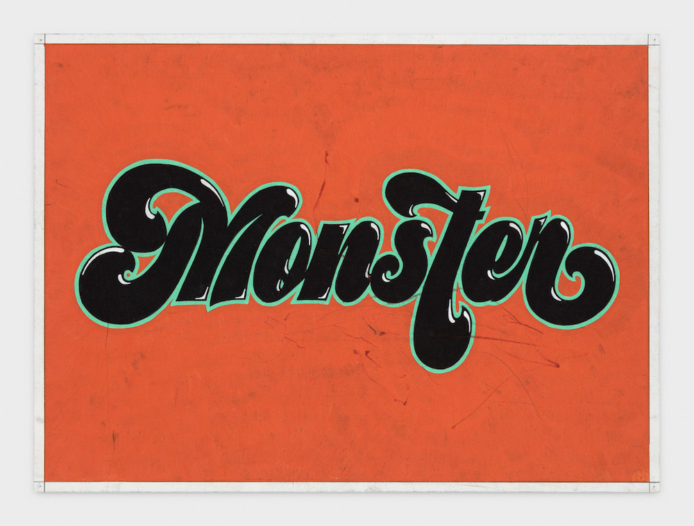 Andrew Brischler, “MONSTER (Orange Acid Trip),” 2018-2019, colored pencil, marker, and graphite on paper, 22 x 30 in, courtesy of the artist and GAVLAK, Los Angeles.
WHITEWALL: Where did the term “Monster” come from?
ANDREW BRISCHLER: The notion of monsters within our collective imagination has interested me since I was a child. When I began faithfully watching horror movies in middle school, I became fascinated by the idea of the monster as this sort of amorphous, dangerous presence making us more aware of our mortality. During my adolescence, when I was grappling with the gut feeling that I was gay, I always felt like “the other” in my overwhelmingly macho Long Island town. Those cheap slasher movies gave me a way to process that pervasive sense of anxiety and dread. They made me understand how much I not only identified with the young girl being chased by a dangerous boogeyman but how I also, at my core, identified with the boogeyman himself.
Cut to 2018. The country was in such a state of anger, paranoia, division, and vitriol during our past president’s administration that I began to seek refuge in those same movies. I rewatched perennial favorites like Scream, The Silence of the Lambs, Psycho, Halloween, and The Night of the Hunter. After binging seven seasons of The Walking Dead and watching countless hours of MSNBC, my mind began wandering increasingly to danger again—to dread, to fear, to dark corners, to that which lurks just outside our periphery. While leafing through one of my books on vintage movie posters, I saw a poster for a 1944 B-movie called, aptly, The Lady and the Monster. The allusion struck me so instantly and on such a visceral level, I immediately made a drawing based on the pulpy typography on the original poster. The series began that day and continued for the next 16 months.
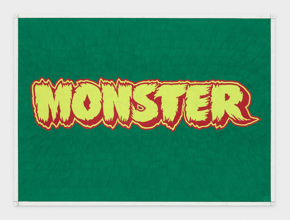 Andrew Brischler, “MONSTER (Hairy Green),” 2018-2019, colored pencil, marker, and graphite on paper, 22 x 30 in, courtesy of the artist and GAVLAK, Los Angeles.
WW: Hollywood, film, and movie posters are often listed as points of reference in your practice and work. The way in which these works are installed reminds me of a film strip that effectively animates the works and overall exhibition in a really powerful way. Can you speak to these references and how they are embedded into this series and show?
AB: The idea of a film strip, or successive frames on a film negative, was never really in my mind while I was making the series, but broader cinematic allusions absolutely were. Since some drawings are appropriated directly from specific movie posters or advertisements, I began to look at the drawings as title cards for fictitious movies. The size and orientation of the paper, 22 x 30 inches, also furthered that logic since the paper itself looked essentially like a technicolor cinema screen.
 Andrew Brischler, “MONSTER (Green Throb),” 2018-2019, colored pencil, marker, and graphite on paper, 22 x 30 in, courtesy of the artist and GAVLAK, Los Angeles.
WW: Can you explain some of the typographical inspirations that infuse themselves into these drawings?
AB: As the series grew, I found myself relying less on appropriating already existing material and focusing rather on deepening my understanding of typography itself—how different fonts convey or upend meaning. I began testing my own inherent taste, using garish fonts that I was repelled by aesthetically but that I was drawn to because the fonts themselves felt somewhat monstrous.
I also did some pretty deep research on the history of specific typographic motifs and on certain typographers like Herb Lubalin and Jonathan Hoefler. I really got in the weeds; sometimes the drawings felt like one giant research project that kept ballooning in size. What I walked away with was a greater understanding of how text can not only be written but also drawn; how it can be read but also seen; how letters are just abstract shapes to which we’ve assigned cultural meaning.
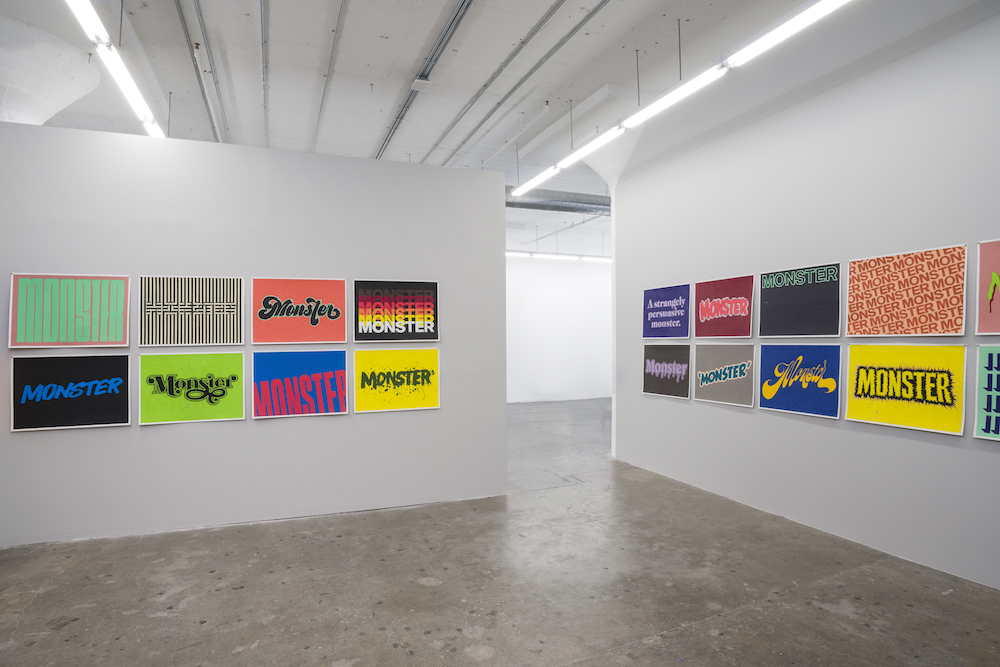 Installation view, of Andrew Brischler, “Monster,” 2021, photo by Ed Mumford, courtesy of GAVLAK Los Angeles.
WW: I also think there is a distinction to be made between typography and composition beyond the text portrayed in each work. The balance, repetition, and acute sensitivities that permeate each drawing demonstrates such a refined restraint and methodical approach to artmaking—can you talk about this as it relates more holistically to your art practice?
AB: My practice has always been, at its core, completely devoted to drawing. Even if there are painterly elements in certain pieces, the paint is often in service of more precise, methodical, and laborious hand drawn elements. It might seem maudlin, but the practice of my eye and my hand working in coordination with one another is a meditative act, a way for me to empty out my pervasive hum of anxiety and feel almost blank inside. The Monster drawings functioned that way specifically later on in the making of the series because the word itself began to lose all meaning. The longer I stared at those seven letters, M-O-N-S-T-E-R, the less the word felt real at all. So in a lot of ways the act of drawing felt elemental, almost automatic, disconnected from the world outside of my studio.
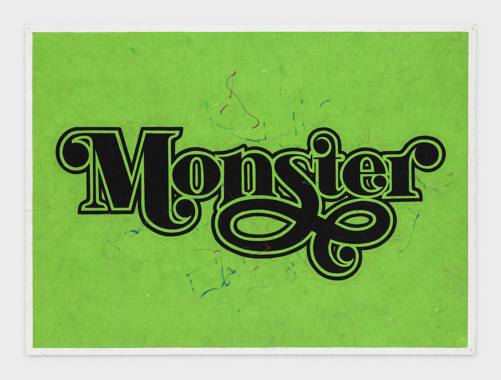 Andrew Brischler, “MONSTER (Green/Black Curlicue),” 2018-2019, colored pencil, marker,
and graphite on paper, 22 x 30 in, courtesy of the artist and GAVLAK, Los Angeles.
Andrew Brischler, “MONSTER (Green/Black Curlicue),” 2018-2019, colored pencil, marker,
and graphite on paper, 22 x 30 in, courtesy of the artist and GAVLAK, Los Angeles.
WW: You have such a sensitive, specific approach to color. Can you explain the process of how these compositions came about?
AB: Try as I might to make work to the contrary, I’ve always been instinctively drawn to high volume, almost confrontationally loud colors. There’s this seduction that happens whenever I encounter work with really intense coloration—the color is like a beacon that draws me in from across the room and makes me look closer. In terms of the Monster drawings, I knew early on in making the series that they would be exhibited in some sort of grid or hung closely together like one long continuous sentence; as I finished each drawing I pinned them to my studio walls that way. My sense of composition is often based on complimentary colors, meaning those that are opposite each other on the color wheel. So if I finished a drawing that was predominately pink, I’d know the next drawing would lean blue or green. If I finished a drawing that was purple, the next drawing would be yellow, etc. Since the textual work can become so conceptual, it helps me to work within the formal boundaries of color theory.
WW: Does this series allude to anything new you’re currently working on?
AB: The Monster drawings are actually the first time I’ve made a body of work that feels almost completely in and of itself; the series very much felt like a “project.” Because I spent 16 months making this work, dealing with the same word in manic repetition, after it was over I felt like I was ready to explode. You have to keep in mind, these drawings are all the same size and they’re all completely handmade, so I essentially sat at a drawing table for over a year. Since completing this body of work right before the pandemic began, my studio practice has swung very much in the other direction. I’m making many different types of works on many different types of paper, some expressively painterly, some textual, some completely abstract. I’m even working with appropriated representational and figurative imagery right now.
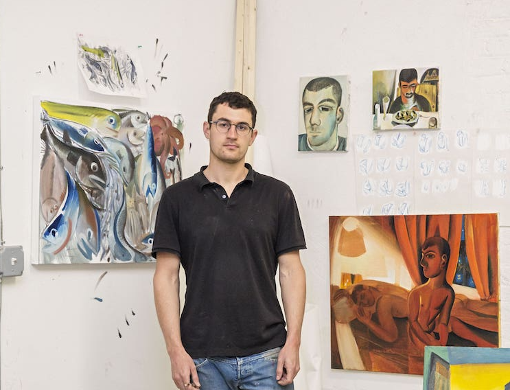
 Portrait of Andrew Brischler.
WW: Can you talk about the process of creating and designing the publication that accompanies this exhibition?
AB: In March 2020, I was asked by Frontrunner Magazine to create a small zine to be offered for free at Gavlak Gallery’s booth at The Armory Show. Aside from the size and page count, I was given free rein as to the imagery, layout, and design of the zine. What I ended up with was a collection of inspirations, studio shots, and close up images of finished works. The project was so unexpectedly generative for me that I knew whenever I had my next show I would create something similar.
Since so much of my practice is about research and the consumption of popular culture past and present, I’ve always had what I like to think of as digital receptacles — ways of cataloguing and shuffling around that what inspires me. In the past I’ve had Flickr, Tumblr, and Twitter accounts, but now I use Instagram. For the artist book that accompanies Monster, I wanted to think about contemporary examples of monsters through the inherent layout of the book: placing two disparate images facing each other on opposite pages. For example; one page has an image of Charlize Theron as Eileen Wuornos from the 2003 movie Monster, and on the opposite page is an image of the poison apple from Walt Disney’s 1937 Snow White and the Seven Dwarves. Another spread features an image of the first edition of Stephen King’s The Shining opposite an image of the professional wrestler Stone Cold Steve Austin (a thick, aggressive, sweaty man I lusted after with particular intensity during my adolescence). What I noticed while laying out the book was that the idea of the “monster,” for me, remains complicated, unresolved, and pervasive over our cultural landscape. Monsters are misunderstood; they’re seductive; they’re repulsive; they’re ready to devour us; they’ve always been here and they always will be.