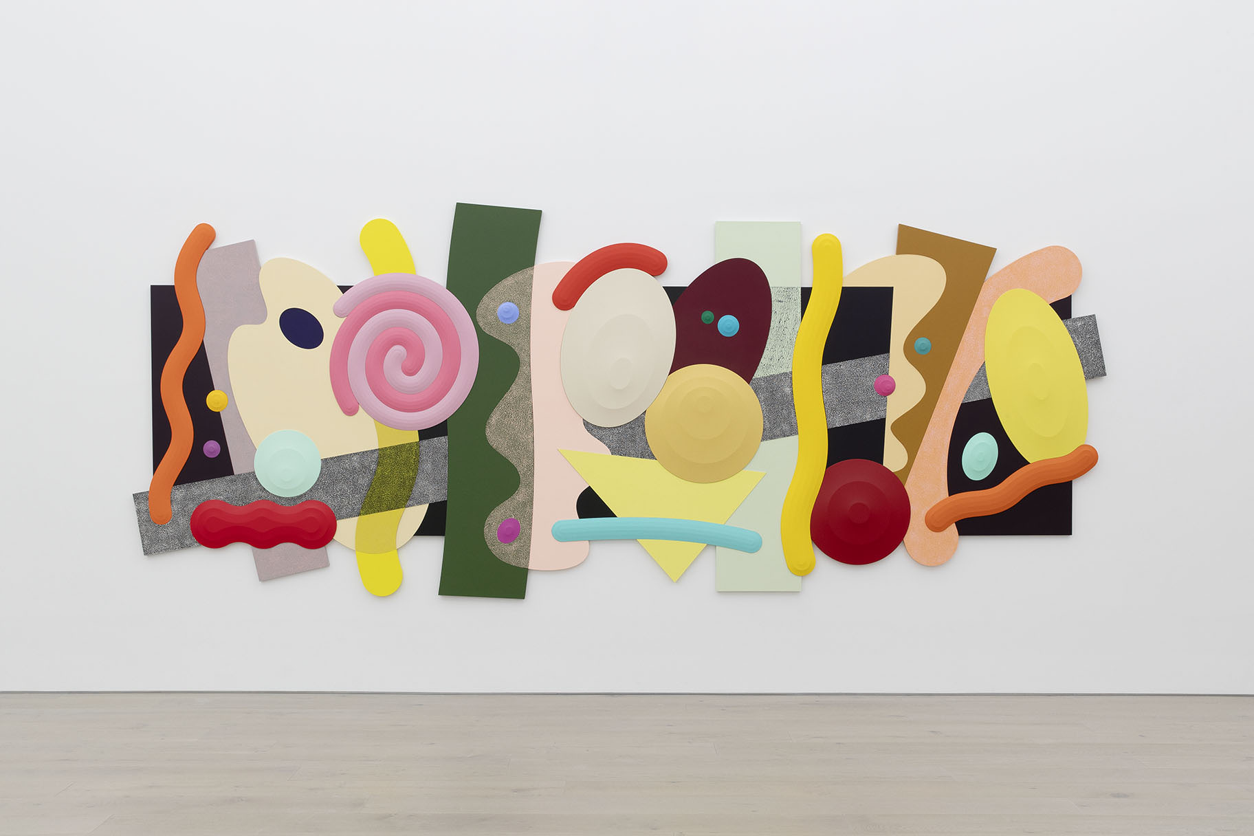
Josh Sperling’s first exhibition at Perrotin in New York, “BIG TIME,” is currently on view through February 16. The Ithaca-based artist has previously shown at the gallery’s Paris and Seoul locations. In “BIG TIME,” he’s adapted his swirling forms and shapes—what he calls composites and squiggles—to the architecture of Perrotin’s third floor.
Whitewall spoke with Sperling about his practice.
WHITEWALL: How did you want your work in “BIG TIME” to interact with the gallery space?
JOSH SPERLING: I always scale my pieces to the room they will be shown in. The proportions of the room compared to the art is very important and the architecture on the top floor of Perrotin New York was especially challenging. The room is over 220 square meters with 6 meter high walls. A room this size could easily overpower the works so I thought it necessary to scale up the works to be proportional to the room. I do think the works have more impact on the larger scale, especially the more minimal pieces. The color is so rich and overwhelming at the larger scale.
WW: You have a unique technique of shaping canvases that verges on sculpture. How do you see your work in relationship to sculpture?
JS: I make paintings but the production has far more in common with sculpture. We use power tools, sand, staple, and cut every piece with a cnc router. I always wanted to be a painter but enjoyed the physical process of sculpture more than the delicate act of painting.
Engineering, graphic design and woodworking are not typical skills used to make a painting. They happen to be the skills I have gained through my life and I have manipulated them to produce paintings. I have spent endless hours perfecting the craft of canvas stretching. I don’t think anybody in the history of art has been able to control canvas the way I do.
My work is a result of the combination of wanting to make a painting but enjoying the process of sculpture.
WW: What mood you want to deliver through your work?
JS: Depends on the shape. I just start drawing new shapes or combining past shapes until I have a composition. This is all done without any preconceived idea of color or mood. The shapes start as black and white line drawings on the computer. Once I complete a composition I choose colors with actual paints and never the computer. I do not set out to make works with a specific mood but once a shape is realized, its inherent mood presents itself and from there a color is easily picked to enhance that feeling.
WW: Do you use color to highlight geometry?
JS: Color can highlight the geometry but also suppress it. Color is very useful for directing the viewer throughout each piece. In general lighter colors show off the relief of each piece and darker colors make the relief more subdued and mysterious. So knowing these traits of colors and how they interact with light and shadow allows me to choose paint that will support the mood of the piece.

