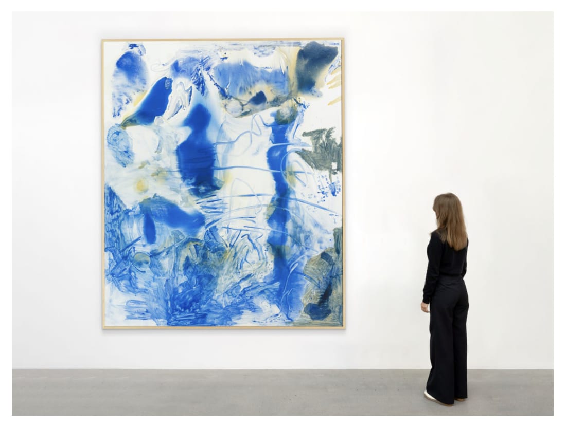
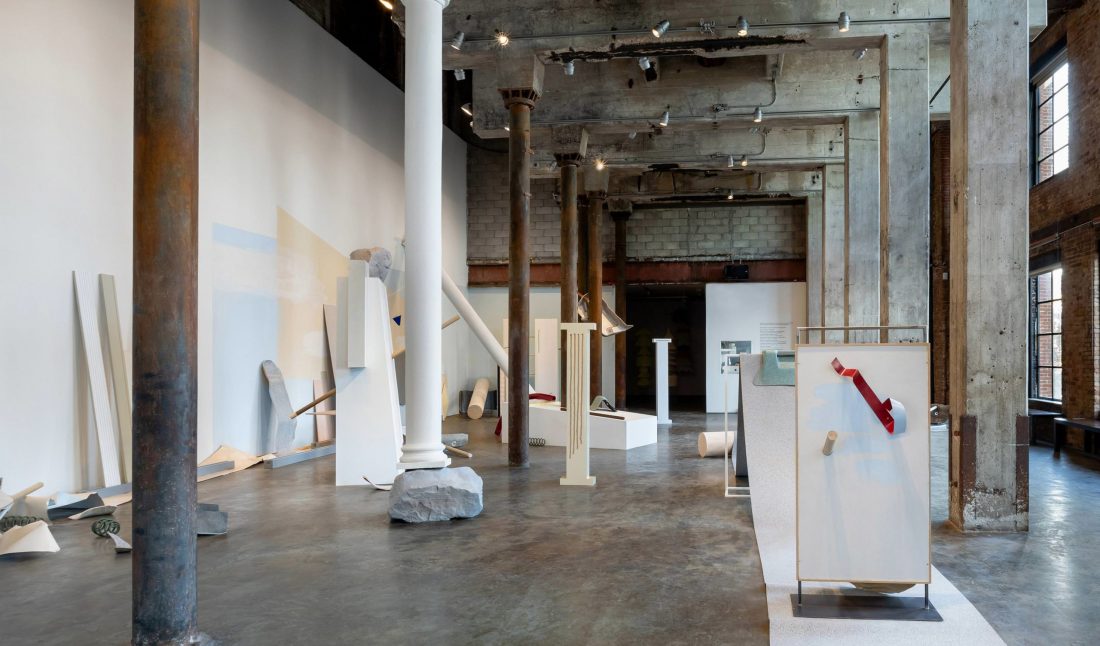
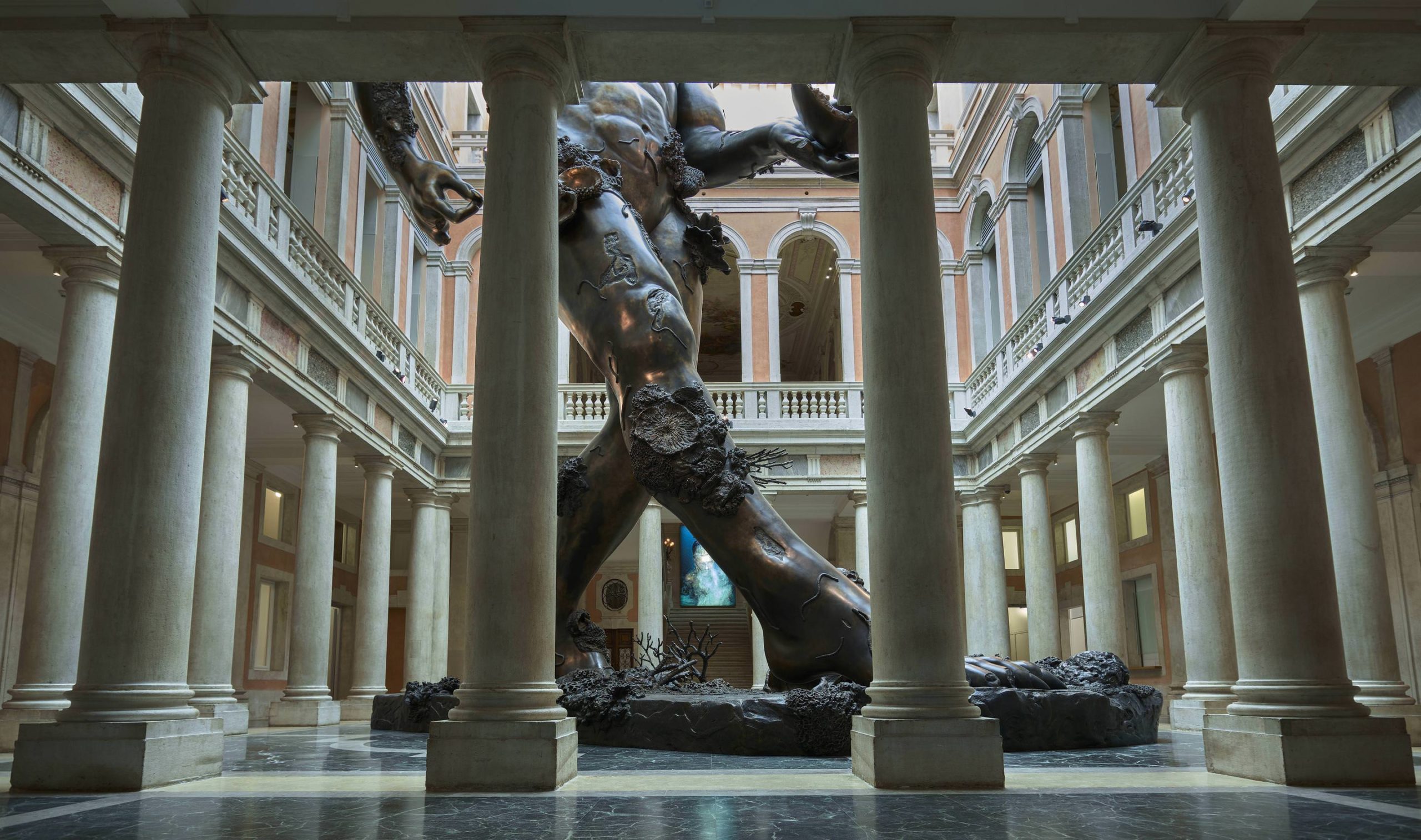
This is the last week to see Katie Bell’s “A Place for Everything and Everything in Its Place” at Smack Mellon in DUMBO, Brooklyn. The Brooklyn-based artist has created a site-specific installation, on view through April 21, within the industrial space featuring 24-foot ceilings and prominent steel columns.
Bell creates assemblages, sculptural paintings, and immersive landscapes from discarded building and design material—old cabinets, hot tub shells, scavenged flooring, and more. Choosing material for color and shape, she plays between the natural and man-made world. Pastels, faux-finishes, and marbled surfaces come together to create new narratives based on location.
At Smack Mellon, the artist found inspiration in the neighborhood of DUMBO—the scale of the buildings, streets, and bridges; as well as the East River and the flotsam that washes ashore. A few weeks before the opening, we spoke with Bell about the show.
WHITEWALL: Since your shows are normally site-specific in nature, where did you begin for “A Place for Everything and Everything in Its Place”?
KATIE BELL: I’m often flying somewhere, finding all the material in that location, and building a work on site. I haven’t’ had a big solo show in New York in a long time. The original proposal was one large, site-specific work in Smack Mellon’s main space. It used to be an old power plant and has all of this architectural visual language that is almost a sculpture in itself. There are something like 20 steel columns. So the building became the armature for the piece.
It unfolded from there from the material I’ve been gathering. I’ve been using things like sections of hot tubs as these abstracted, knowable but unknowable organic but so manmade forms. I was also thinking about the East River and the flotsam and junk that floats up there—these foreign objects that have this warn, other worldly quality; like they’ve been through something. It was about, how do I create a landscape-like sculpture that also feels like it’s part of the building?
WW: You often use man-made material that is posing as something natural—like a marbled hot tub shell, for instance. There exists this contrast between color, design, and source. How does color draw you to a material?
KB: A lot of the things I’m working with come from some sort of interior—old countertops or flooring—these pleasing, nice to be around environments. I’m interested in the duality of a soft palette mixed with the large-scale and harsh nature of the material itself; something that is heavy and big and falling apart.
My mom picks paint colors for people’s homes in Rockford, Illinois where I grew up, for places like Nissan dealerships and dentist offices. So she has paint charts around the house. I come from a painting background, and when I started working with sculptural material, I didn’t know where to start with color. So I asked her for her paint charts for different clients, which were house paint colors. It’s unfolded from there, where I’m pretty drawn to a pleasing interior design aesthetic, which gets questioned by how things are then put together.
WW: You said that usually you find materials in the location of the exhibition. Is that your preference or is it done out of necessity?
KB: It started as a necessity. I wanted to work large and the easiest way to do that was to fly and make it rather than ship something. But then I was pleasantly surprised by how many possibilities it opened up, not knowing what you would find in a place and seeing how materials and palette changed from Miami to Chicago. And I would get to know a place by looking for materials, going to salvage yards, calling people from Craigslist, going to their homes…
WW: How does the narrative then reveal itself as you source material and put it together on site?
KB: For this show I’m making some objects—painting built panels of different materials. I was recently at the Lord & Taylor that closed and got all these really weird plastic fake boulders. There’s going to be large scale columns in addition to the columns in the space. Overall I want it to be a strange abstracted landscape that the viewer encounters, something unknowable that unfolds the longer you look at it.

