Johnny Johansson, the creative director of Acne Studios, was sitting under a bridge in Stockholm at the Rålis skate park. Skaters glided over concrete bowls lined with bridge pillars, and soon he was dreaming up a way to translate that setting into architectural space. “I find it a poetic spot, and it reminds me a little of Paris because there are so many bridges in the city,” said the Swedish designer. Fast-forward to June of this year, at 219 rue Saint-Honoré, when Acne Studios opened its new two-floor flagship store. All different in nature, playing off of local flair, these spaces are often atmospheres in which Johansson dares to dream a little, balancing his nuanced approach to textiles.
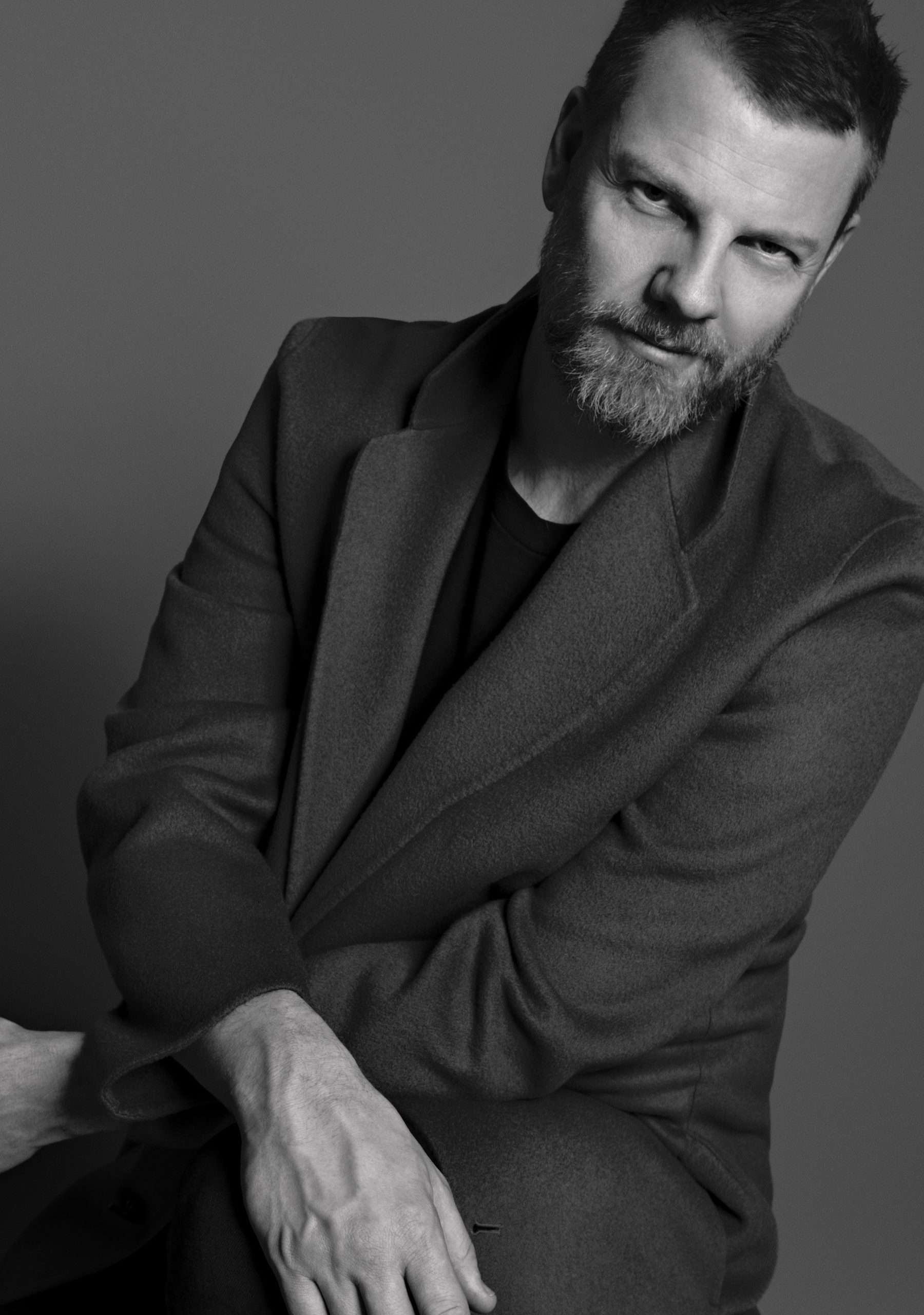 Portait of Jonny Johansson, courtesy of Acne Studios.
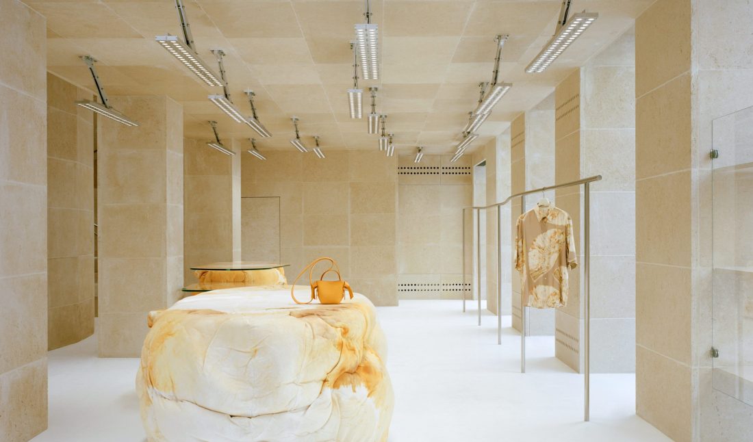
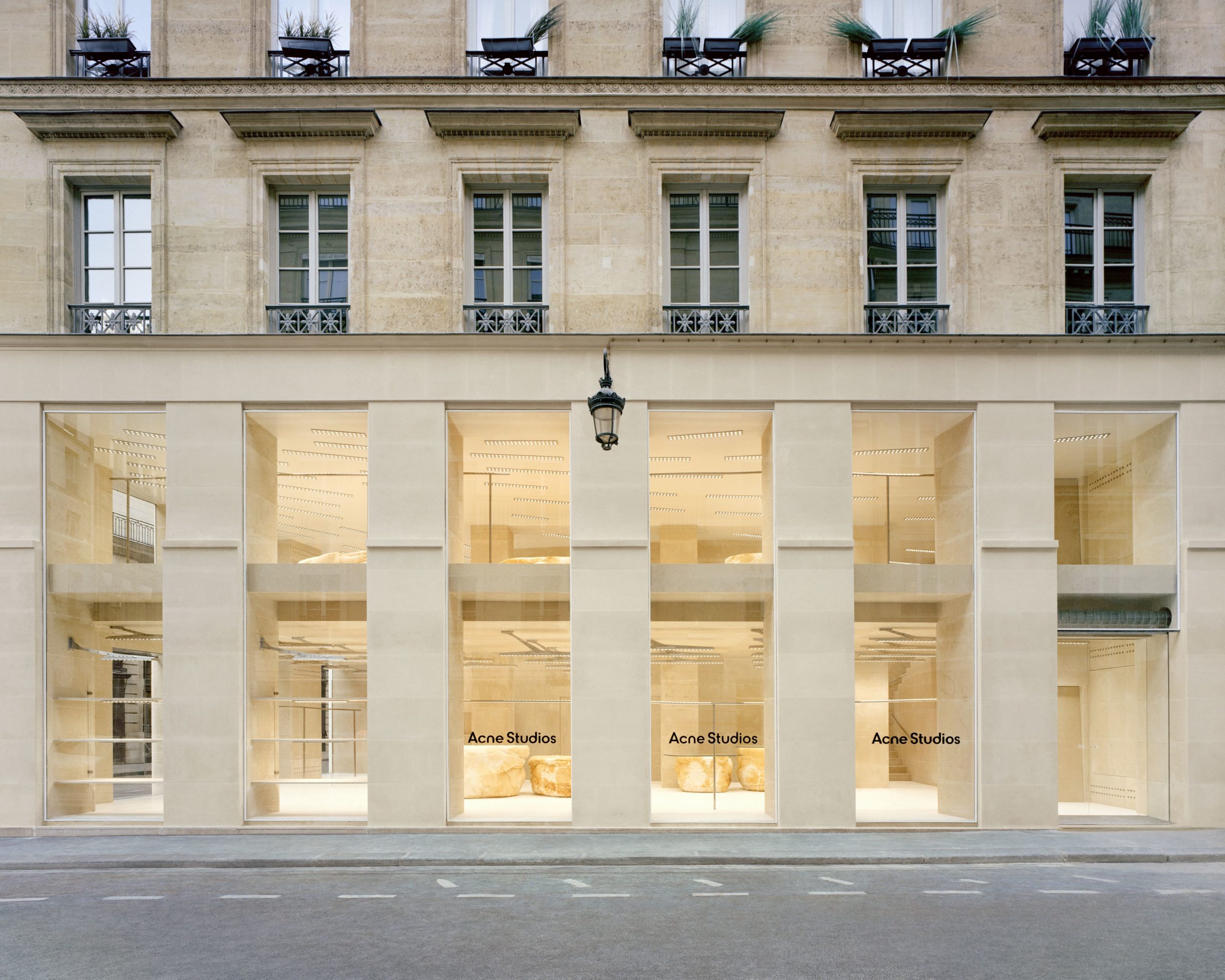
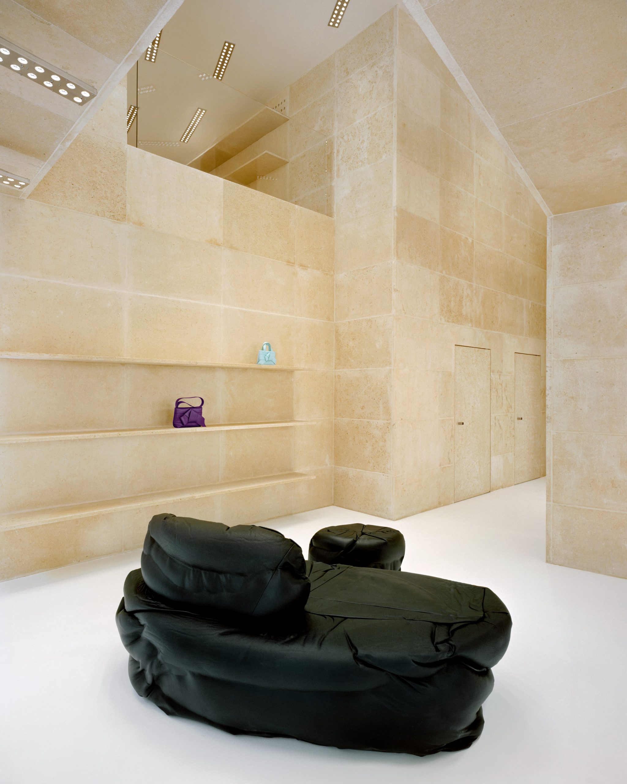
Designed with a longtime collaborator, the Barcelona-based architecture studio Arquitectura-G, the new boutique is built almost entirely of Saint Maximin stone, extending beyond the exterior façade to the interior of the store, even creating doors, stairs, and shelves, too. Sourced from a nearby French quarry, the golden-hued limestone is synonymous with Paris, as it has been used to build many of its landmarks and institutions—from the Louvre Museum and the Place de la Concorde to many of the city’s bridges. This approach to material and space exemplifies a quintessential Acne Studios move, considering the space’s connection to the city in which it resides.
“Saint Maximin stone is key,” Arquitectura-G told Whitewall recently. “This stone has been extracted in a nearby quarry for a long time, and its presence is a constant landscape in the city’s facades and infrastructures. It has indeed been called ‘la pierre qui a fait Paris.’ This material was local, but also in a way abstract, so we thought it was a great choice.”
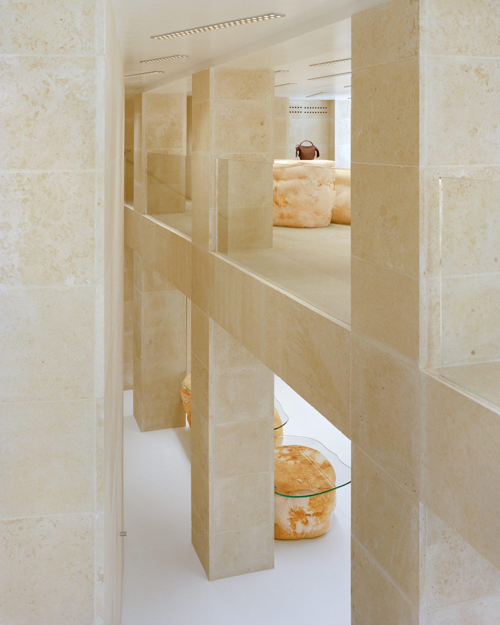
Running from the outside in, comprising the walls, floors, and columns, the ubiquitous material is similar to the concrete-filled atmosphere and infrastructure of the skate park. “I wanted the store to feel like you were sitting under a bridge,” Johansson said.
To bring this idea to life, Johansson shared references of bridges with Arquitectura-G, who laid out a structure that considered the park’s framework and the visual relationships between the store’s two floors. “The store had originally two totally separate floors, and the first floor had a very low ceiling. We created a cutout in the slab, so all the space became one with a double height space,” said Arquitectura-G. “Suddenly, the columns emerged, in all of their height, as parts of a larger structure that happens to be a store. Now the first floor breathes. It was a very structural approach to the space. The stone worked well for both purposes—the local image and the image of a strong monolithic structure.”
 Courtesy of Acne Studios.
Floor-to-ceiling windows that were original to the site were stripped back, allowing additional light to flood its rooms, now with double-height ceilings that connect both floors. And the view works both ways, allowing foot traffic to see inside for a peek at seasonal collections hung from industrial-feeling rails. “We didn’t only want the store to have a connection in terms of materiality, but also a dynamic and active one with all pedestrians. Given the fact that the store is at a corner, we had two facades to let the store to be seen from outside, but also to let the city be visible from inside. We kept all the floor-to-ceiling windows clear in order to maximize this connection with the city and its light.”
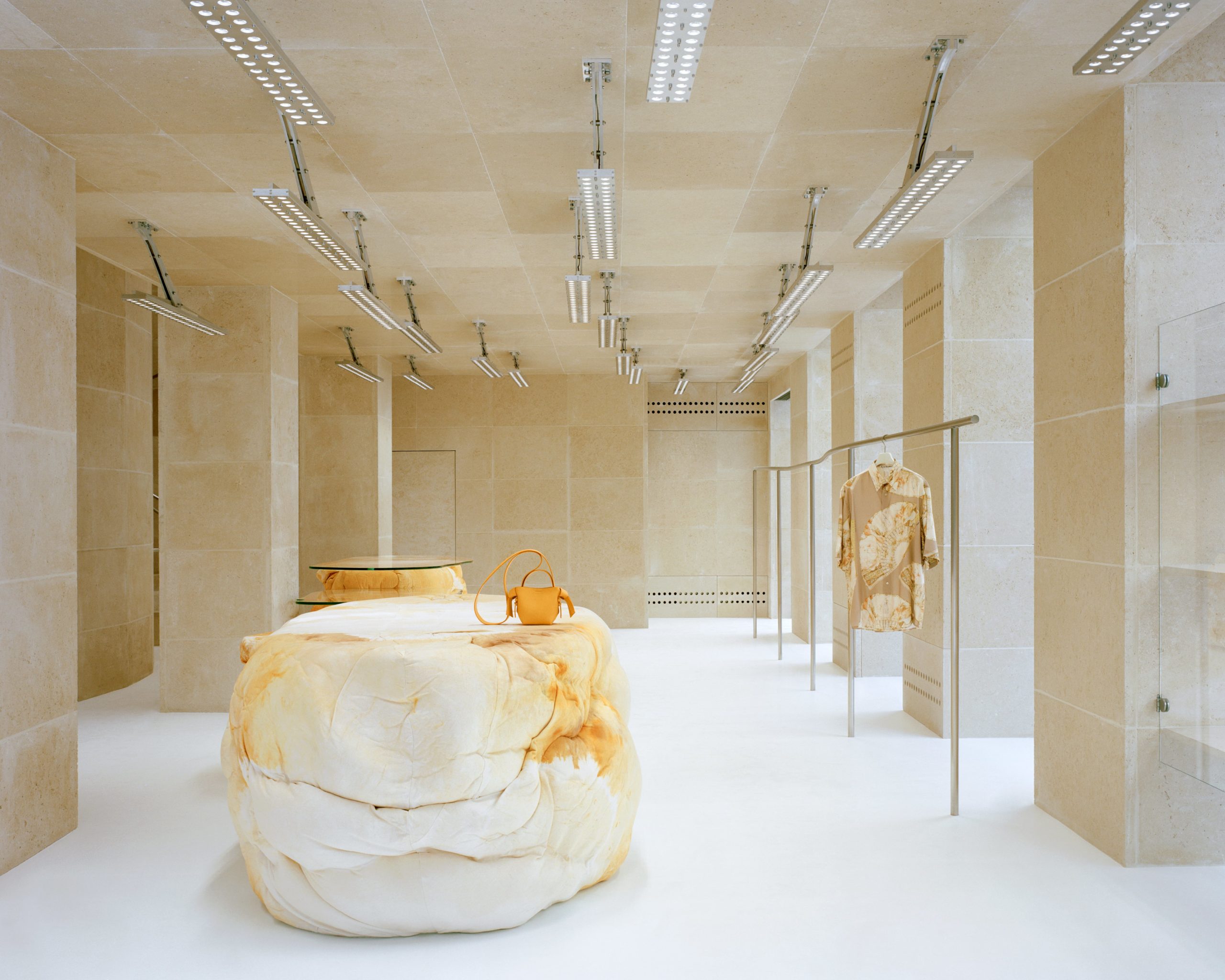
Over 385 square meters of interior space marries the elegance of the city with the counterculture of Stockholm—the fashion brand’s home. Against the stone background and shelves, distinct fixtures accompany customers throughout the space, guided by curved metal rails that double as staircase handrails and racks for garments. Elsewhere, soft furniture pieces created by the British designer Max Lamb are organically shaped, offsetting sharp doorways, shelves, and stairs. Black leather seating and hand-dyed fabric display units and tills make for a dynamic conversation between colors, silhouettes, and materials.
“The contribution of the pieces by Max Lamb is key to both displaying products and organizing the circulations,” said Arquitectura-G. “In contrast to the hard and rigid stone structure, we have a series of soft pieces that are sometimes used to sit on, like black leather, and sometimes used to display products, like cotton fabric. You always have garments by your side but also everything feels very open.”
Above, lighting fixtures by the house’s longtime collaborator Benoit Lalloz reflect a natural flow. “My vision for the lighting of the space was guided by a double idea of movement,” said Lalloz of his approach to the space. “My job is to accompany an architectural project as best as possible. To allow full or empty volumes to stand out fully.”
 Courtesy of Acne Studios.
To accomplish this, Lalloz considered the space in relation to a layout of lights that could enhance its aerated floor plan and catch the attention of passersby. “The ceiling on the first floor seemed very low to me; it was both invisible and very heavy. My idea was to create a layout of the lights that would be immediately visible from the outside—almost like a sign, a graphic design, an affirmation of a new presence, like a seventies advertisement in flashing neon lights,” he said. “Then I decided to bring a high level of lighting to ‘decompress’ the place and deconstruct the appearance of the ceiling and the space.”
Only seen from certain angles, curved and converging lines took the place of a traditional frame of lights. “The gaze glides over this ceiling, with no point of reference other than that of vanishing lines on which the lights spin like words,” said Lalloz. His poetic approach to light and space continued through the rest of the store, as he dreamed up a new inverted ground floor space that was weightless, buzzing with those from the skate park. “I imagined this space upside down, in weightlessness, crossed by racing skaters.” Instead of rigid lighting that felt heavy and contrasting, luminaries that Lalloz called “metal sheet” pieces were put in place.
“The light is extremely soft,” he said of the fluid designs. “There are very few shadows in the space, rather gradients. This equal and soft light comes from a combination of particular optical systems, but also the spatial distribution of light.” Questions—like what temperature of light might work best for the architecture and what perception can it give empty spaces—were considered. “There is no conscious desire to allow natural light to overlap with artificial light, rather a visual interplay between summer and winter, night and day, cold and warm, light and dark, full and empty, outside and inside,” added Lalloz. In the end, he decided it was best “interpreted very skillfully by clear and assertive architectural choice.”
 Courtesy of Acne Studios.
For the store’s debut in June, the men’s and women’s Fall/Winter 2022 collections were on display alongside a selection of shoes and accessories like Acne Studios’s iconic Musubi bag. Also featured was a collection in collaboration with the Lisbon-based French artist Martin Laborde, including slip dresses, Lurex T-shirts, hoodies, and silk scarves that feature everyday images and objects as collages.
Here, the flagship feels like home for the ideas Johansson dreamed up that day in the skate park. With careful consideration of material and light, while also staying true to its Stockholm cool-kid roots, a new kind of experience exists on the storied Parisian corner. “I like the idea of a secret society, a subculture, existing under the arches—and I thought it was a good way to think of Acne Studios as a brand on the big fashion street.”
 Courtesy of Acne Studios.
