Winka Dubbeldam is the founder and president of the New York multidisciplinary firm Archi-Tectonics. Founded in 1998, her architecture studio has been involved in research-based design that ranges in scale from objects to buildings to cities. She has been behind residential buildings in New York, contemporary art galleries such as Frederieke Taylor, retail spaces including Ports 1961, spas and meditations spaces like Inscape, and even bottom-up urban planning projects for cities such as Bogotá.
Born in the Netherlands, Dubbeldam originally went to school for sculpture, but soon switched to studying architecture, interested in broadening the audience of the work she wanted to create. Her designs are informed by the visual arts while remaining grounded in rigorous analysis. She is currently professor and chair of the separtment of architecture at PennDesign in Philadelphia. Whitewall visited her in her office earlier this year to discuss the wide scope of her practice.
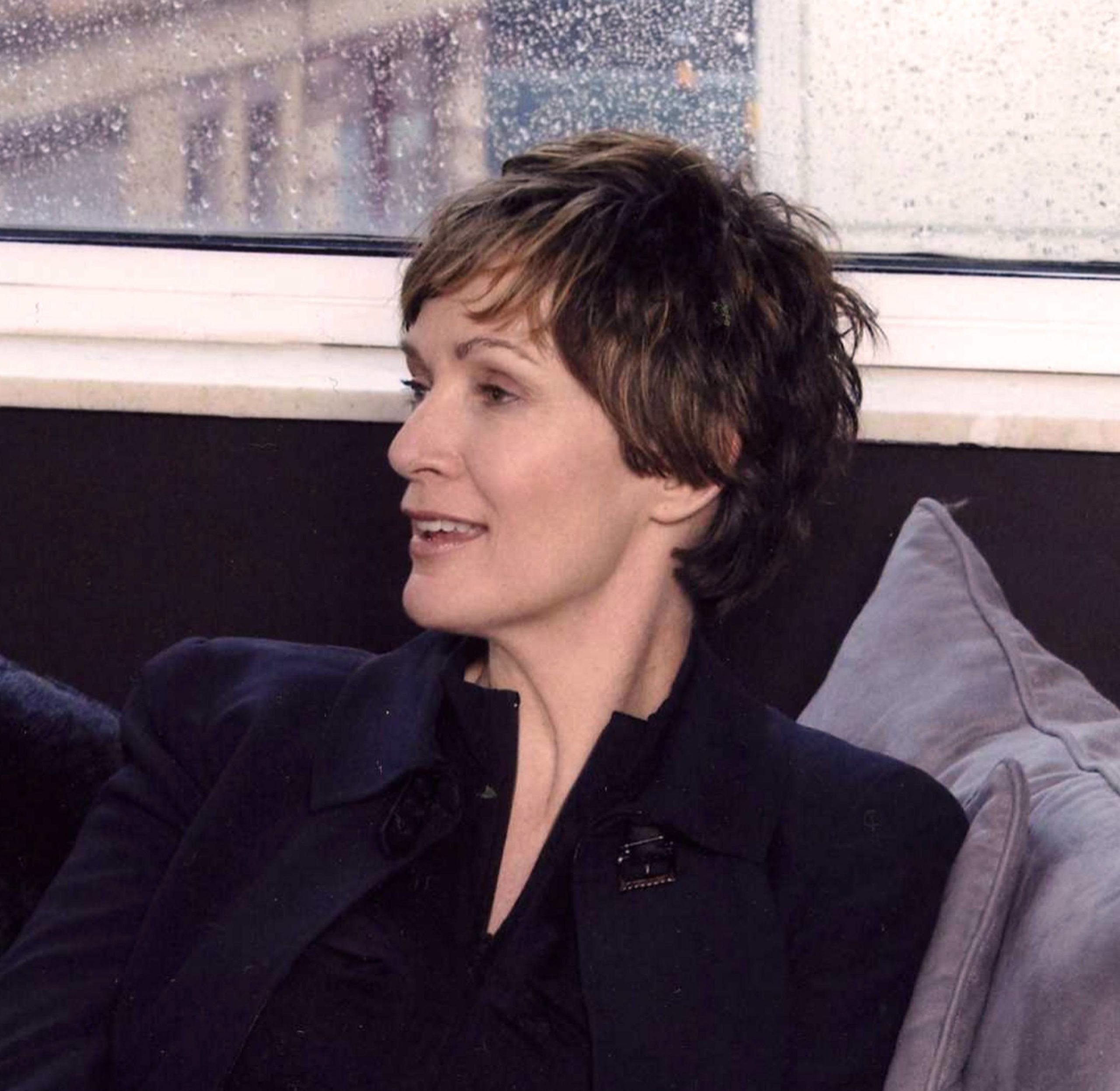 Portrait courtesy of Archi-Tectonics.
WHITEWALL: You initially went to school to become a sculptor. And while you didn’t end up pursuing that path, you’ve said that being at art school was formative for you because it really taught you how to think independently. Can you tell us more about that?
WINKA DUBBELDAM: They are really brutal in art school. The good thing is that when you’re young you have so much confidence. I loved sculpture, but I decided to change my major, because I didn’t want to be a sculptor. It was a question of creating things for who? So I switched to architecture.
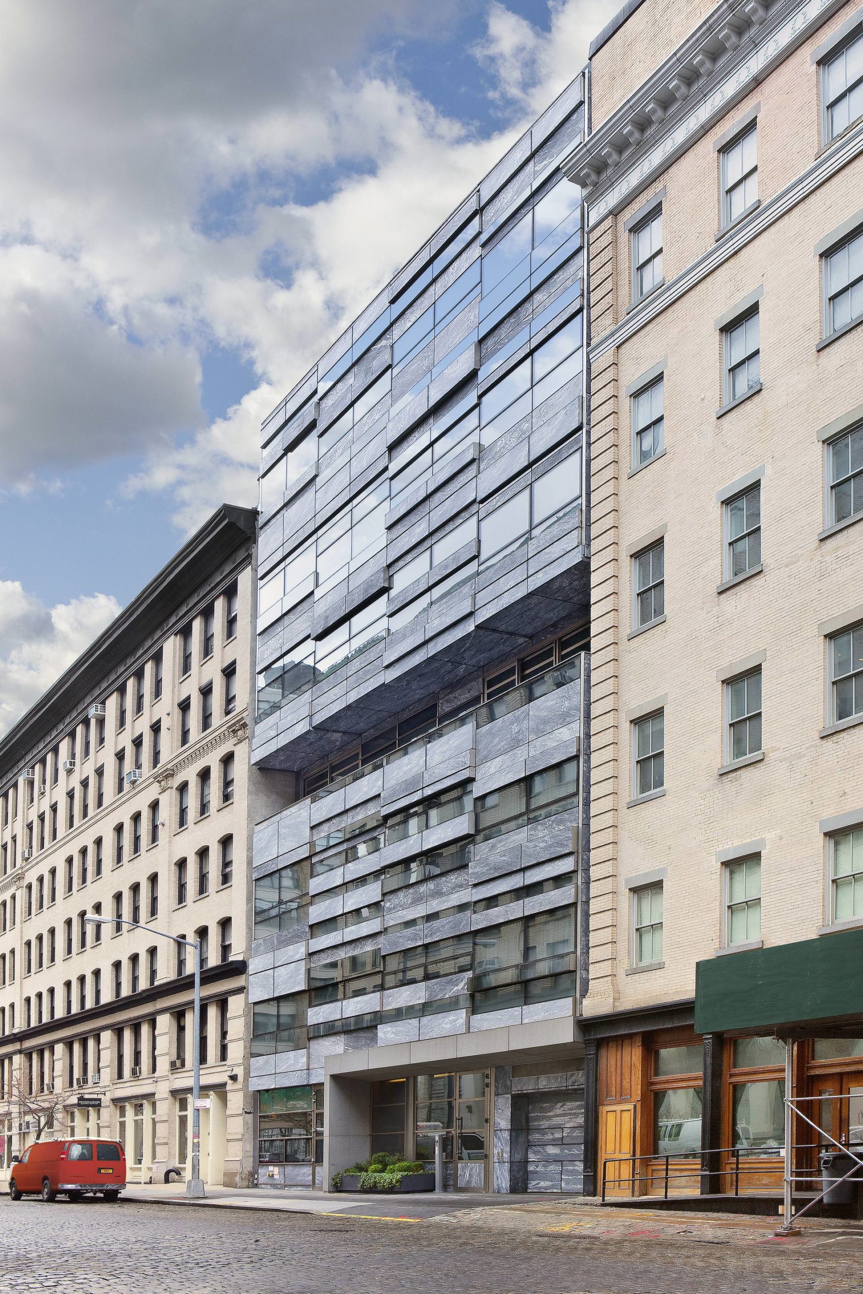 V33, a residential building in Tribeca, New York.
And I really love architecture. Even in the nineties I was already working with computers. I could think of space in 3-D. And then I came to New York to Columbia.
WW: What initially attracted you to coming to New York?
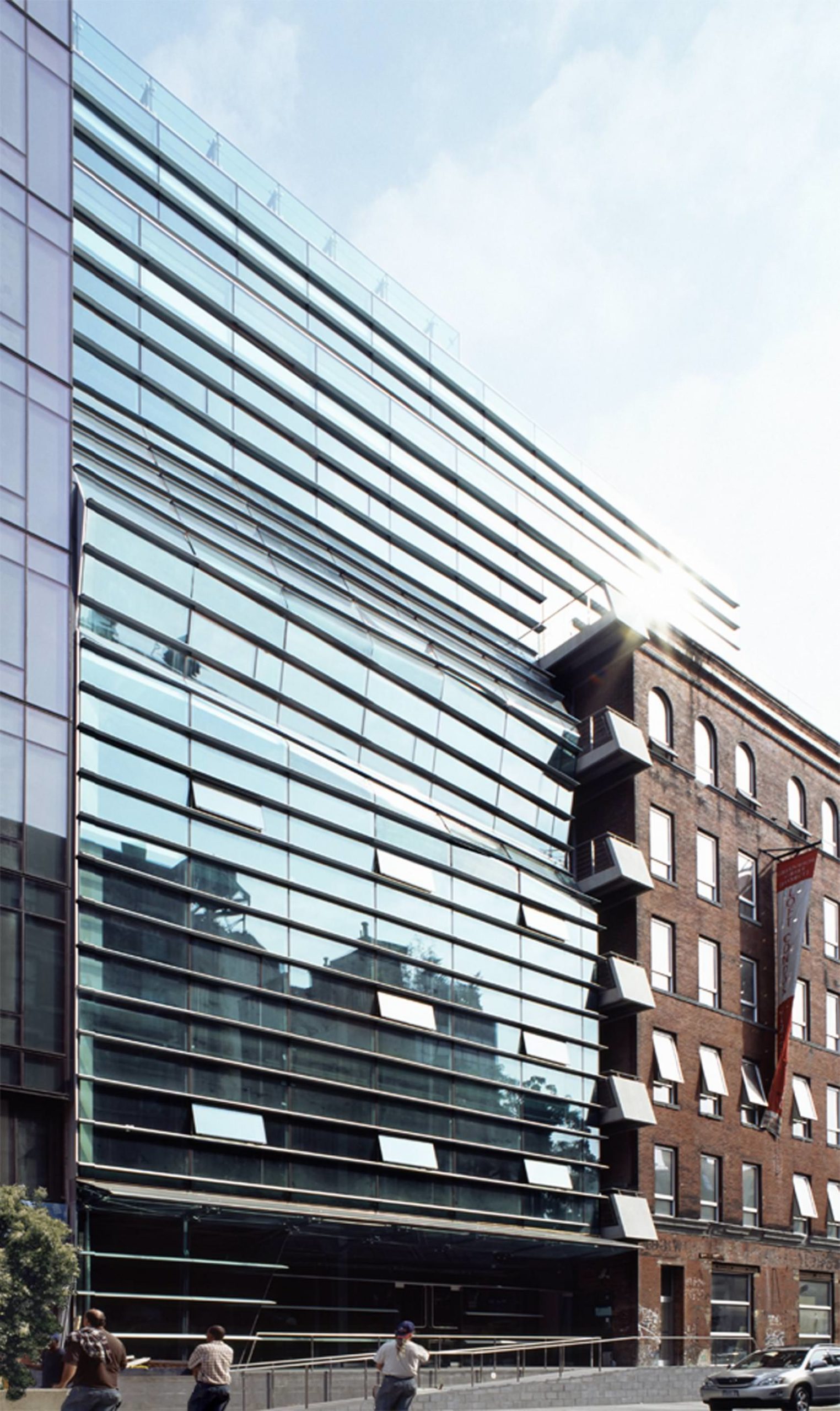 497 GW Project in West Soho, New York with 23 residential lofts, a gallery, and retail spaces, completed in 2003.
WD: Columbia. The Dutch architecture program is really long, like six years, and it is very good for analytical design but there was no philosophy. Then I came to Columbia and I loved Columbia—I was so happy. I was never really planning to go back. I love Holland socially, but I don’t like working there as much.
WW: You have had so many projects in New York, so what do you like about working here?
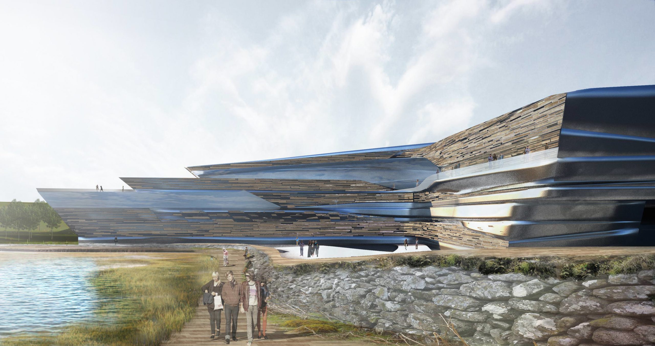 Rendering for the New Rochelle Waterfront.
WD: I love the fact in New York you can really be yourself. New York is extremely accepting of any foreigner or of any way of thinking. You have to be really, really fast, and things can flip overnight. I love working in Manhattan—it has been super-fun.
WW: I think it’s interesting, too, that some of your early projects have been galleries like Frederieke Taylor. What kind of considerations do you have to make when designing a space for showcasing art?
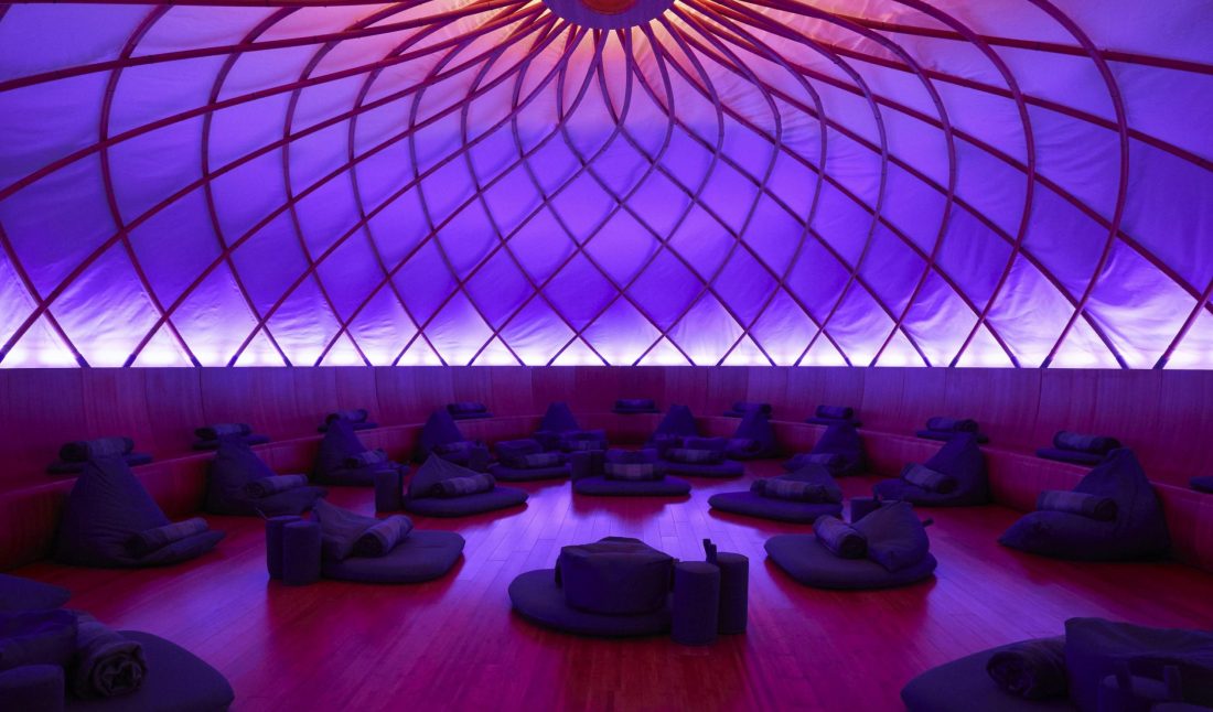
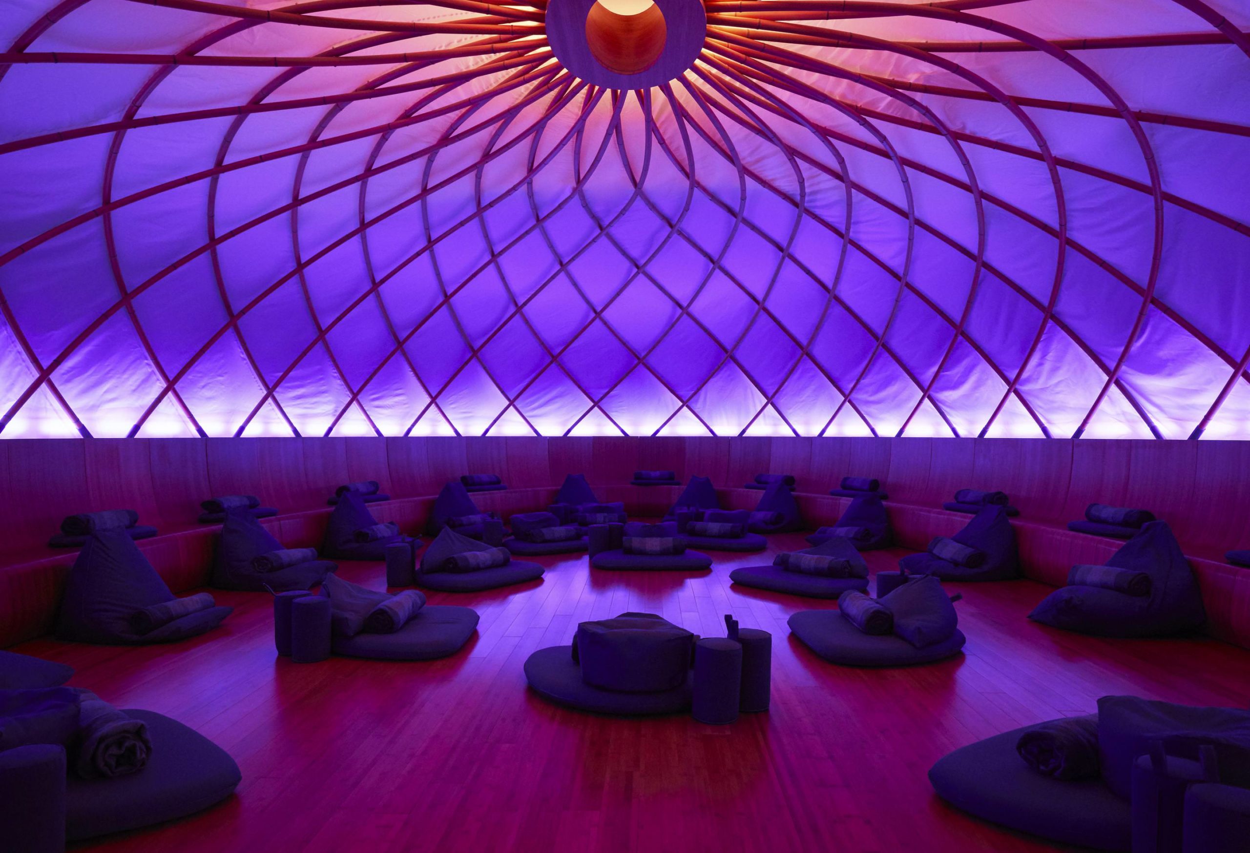 Inscape meditation concept in Chelsea, New York, completed in 2016.
WD: My first project was an art gallery on Broadway. I did graduate in art and architecture. It is kind of a natural, I guess. In that gallery I had a lot of fun, because the building was an existing little garage. Inside we did very small changes—we opened big skylights—but very simple, clean spaces. But because the gallery had put a wall behind the facade, I convinced the client that we should put TVs in the window and the monitors could either transmit video art or it could be connected surveillance to see what is going on in the gallery. People were so curious. That was a really fun gallery.
WW: You’ve said that so many gallery spaces are white boxes, but we as humans don’t really want to be inside a white box, so you’ve tried to play around with that as much as you can.
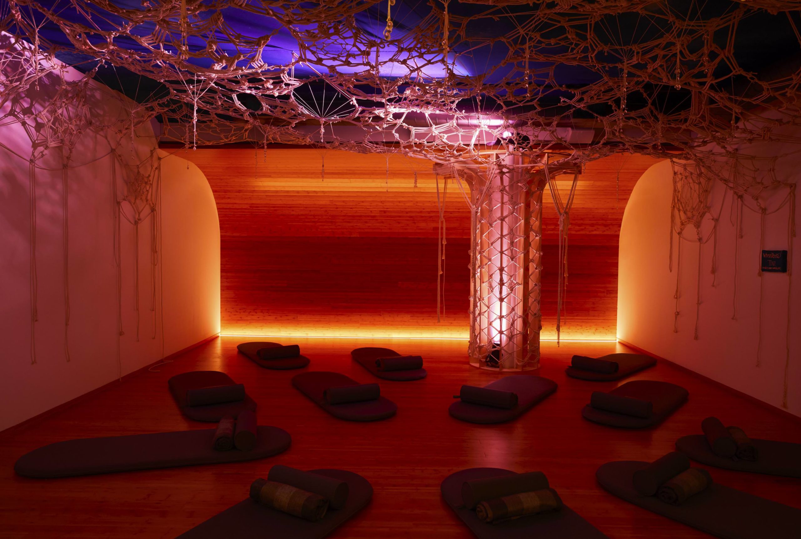 Inscape meditation concept in Chelsea, New York, completed in 2016.
WD: A lot of it is changing the way it’s lit and the way people move through. I think there is kind of a fixation on the square box. We as a person are not a square box, so why would we make a square box? And light is not guided the best way by straight walls, nor is sound. And that was also the idea for Inscape.
WW: Right, Inscape, the meditation space you designed in New York. What was the initial brief on that project?
WD: I know the owner, Khajak Keledjian, very well. One day he invited me for lunch, and he explained to me how he was working on a new concept and asked if I had some advice for a young architect who could help him out. I guess he knew me from doing buildings. But as he was explaining the concept of Inscape to me, I was like, “Khajak, I have done yoga since high school and meditated for 20 years—I would love to work with you on that.”
I have always been interested—and it probably comes from my sculpture background—in looking at how architecture could learn from industrial design. It is mesmerizing, if you think about your car, how you push a button and a window goes down. And in most buildings you can’t open the windows because they are painted shut!
I wanted to make a space that from the outside is not very telling of what it is on the inside. I also wanted it to look like some heavy volume that was hanging from the ceiling that lightly touched the floor, but inside it is encapsulating you. Having done yoga and been in spas, there are always these ugly ceilings, and I was like, if we do this, we have to make a space where every surface is attractive. It has to be an environment that is about light, sound, smell. Your senses have to be soothed. We come from an aggravated environment, from outside where you are constantly attacked, so the first thing that they do really well is they have a little bit of song, and aromatherapy in the air.
WW: How did you decide on the lighting for that immersive space?
WD: It is a hard thing to learn meditation, because when you come in you have a million things in your head. When you come in, the lighting is pretty even, but then when you start the meditation the top ring of light moves down the walls and sinks down to the bottom ring. The easiest way to meditate is to sit by the ocean or in a desert or a landscape where you have a horizon. So the idea was to make a space where you have no corners—infinite. So this ring of light, when you maybe freak out halfway through the meditation, you can open your eyes and know where you are.
And then the other thought was to make a bench so you could sit on it, or lean against, and then when you are finally comfortable you can sit in the middle on a little pad that we also developed. We did industrial design with the pads, and we worked with a car-design company on the whole room.
It was fun that the idea of industrial design was something I could totally work into this, and it was great to work with those people.
WW: You’ve also worked on urban planning, like for downtown Bogotá in Colombia. Can you tell us what it’s like to work on that scale?
WD: We learned a few things in the sixties. One is that you can’t start a new city from scratch. It’s not a holistic model, and it is just too dictatorial. We also learned that suburbs are not necessarily the best models, so people are moving back into cities.
I think it was probably one of the most amazing questions that I ever got in the office, a client saying, “I would like you to design me a plan for downtown Bogotá.” This is the first time that someone asked a question that completely combined academic research with practice. Bogotá has 33 different schools and universities in its downtown region and 1.8 million people commuting into the downtown area, and a million of them were students. So we said the most important thing is to get the traffic jams out of the way to create more life in downtown and more services in downtown. We start creating micro housing and student housing, buying up old office buildings that were empty. That was instant and a quick move. Then we developed a terminal where you had big box stores at the edge of the center. It was very cheap parking and all of the public transport moved into the downtown. So you switch the point where you could do all this shopping before you take public transport.
Bogotá sits at the bottom of an area that used to be wetlands. When it rains, the whole thing floods like three or four times a year. It is a nightmare, so we proposed bringing one river to the natural riverbed to create more wetlands to allow urban agriculture so people could start to grow things and could use it for recreation to solve the flooding. Allowing for farmers markets creates a new economy for these people, and you solve flooding.
We offered solutions based on the idea that you don’t superimpose architecture on urban infrastructures. You really do it in a way that grows social, cultural, political, and economic inputs.
WW: Is art still a passion for you?
WD: Oh, definitely. And I see architecture as art. I feel that every project that we do is one major innovation that I want to push through. I think we make things very sculptural. When architecture has a certain shape, it creates a completely different environment. Lights hits it differently, it is different to move through it, and your relationship to it is different. And to me that is much more important than if it is formal.
This article is published in Whitewall‘s 2017 Design Issue.
