
Benoît-Pierre Emery, now the creative director of Objets et La Table at Hermès, started out as a graphic designer in Paris, consulting for brands like Arte, Cabane de Zucca, and Kenzo. Over time he became interested in designing accessories, and launched his own scarf line. That eventually caught the eye of Hermès’s Pierre-Alexis Dumas, who took him under his wing at the historic house, where he would move from creating silk carrés to tabletop. The latest collection, “Voyage en Ikat,” is no small feat, and also seemingly blends Emery’s interest in textiles and tableware. He and his team took time to translate a sixth-century pattern from fabric to porcelain. We spoke with Emery about fashion and the decorative arts, and he even gave us some advice on how to best create an Ikat tablescape for any occasion, playing with color and always adding flowers.
WHITEWALL: You went to school at the Royal College of Art in London. What initially drew you to decorative arts and design?
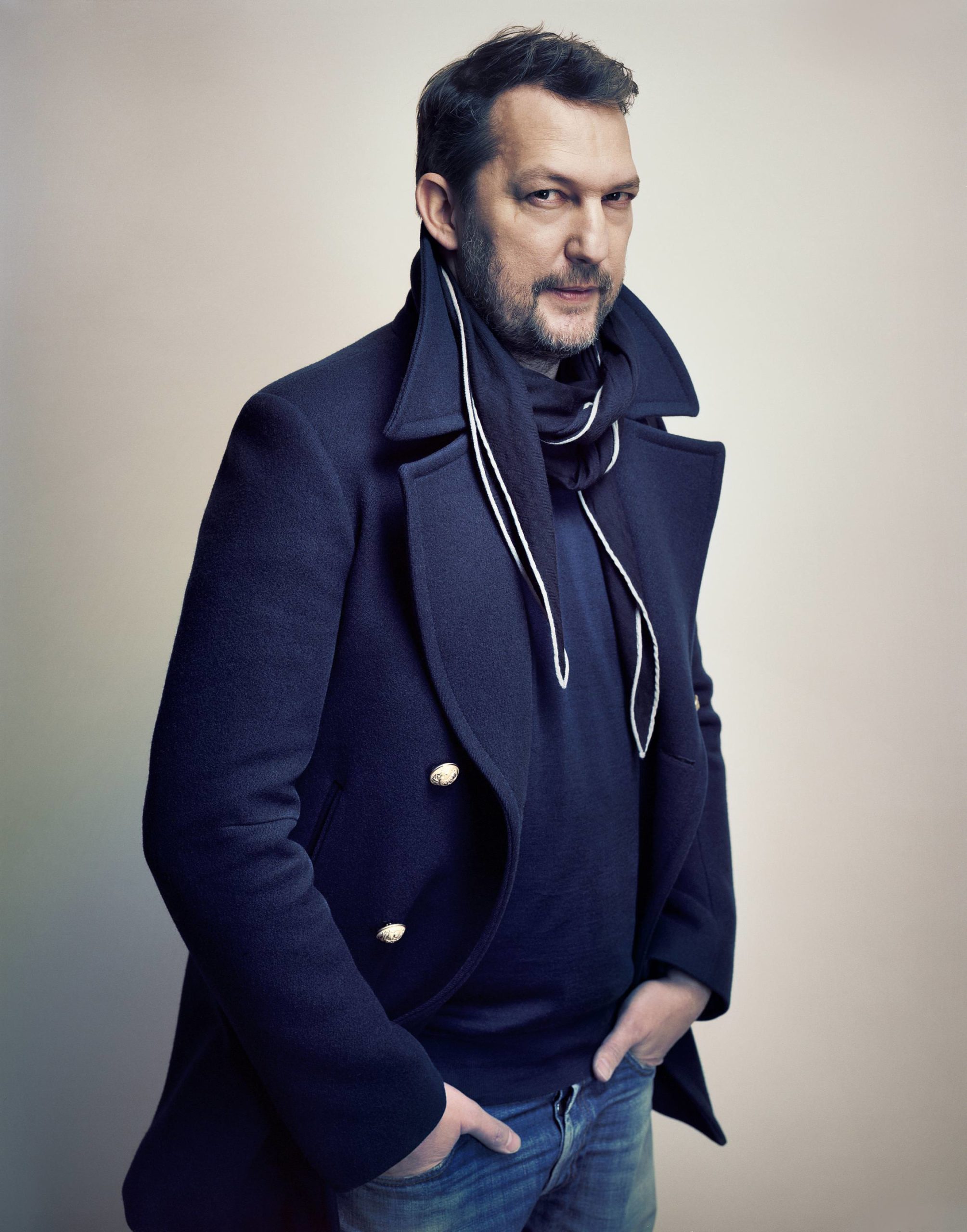 Alexandre Guirkinger
BENOÎT-PIERRE EMERY: I started drawing at a very young age and I’ve always had a particularly strong sensibility to decorative ornaments and objects. While attending RCA, I started to develop a strong interest for fashion and textiles. The way colors were so bright when printed on silk was something I loved, and I spent my time experimenting with many different printing techniques. Developing my own line of silk scarves was a dream at the time.
I never believed much in boundaries between art and decorative arts. Often you find plenty of creativity and talent in the simplest, raw craftsmanship. That is probably why I love Hermès so much, as the respect for both artists and craftsmen is very high in the house.
 Courtesy of Hermès
WW: You designed your first scarf for Hermès in 2005, for the 10th anniversary of “24 Faubourg.” Can you tell us about that first collaboration?
BPE: At the time, I had my first collection of silk scarves released under my own name, producing with the Hermès ateliers. During the same period, Pierre-Alexis Dumas came to visit me in my studio and kindly invited me to be part of this first collaboration. I was very excited and of course quite intimidated to design something for Hermès.
 Courtesy of Hermès
For this first scarf, I designed a graphic interpretation of the original perfume bottle. The scarf was composed with shades of lines expressing color vibrations and the immateriality of the perfume. It was abstract and colorful.
WW: In 2011 you designed your first a tableware collection for Hermes, “Rallye 24,” with Damian O’Sullivan. Was that your first time working with tableware? How did that compare to designing scarves?
 Courtesy of Hermès
BPE: I previously designed the “Mosaique au 24” line a few years earlier, so in fact “Rallye 24” was my second tableware collection for Hermès. In the first project I was only involved in the graphic part. Therefore the experience was really different with “Rallye 24,” as we worked very closely as a team with Damian for almost a year. We built the whole project together.
Designing a scarf and tableware are completely different. On a scarf you express yourself on one item and one format. You tell the full story on its surface. When designing tableware, you have to design each piece as a unique item, but also keep in mind how they will fit with the other pieces of the collection. You have to find the right expression in terms of graphic design and the right balance, and each piece needs to complement the other. It is also important to not fully cover all the set pieces, especially the plates, as you need to leave room for the food.
WW: You’ve since become the creative director of Objets et La Table at Hermès. How, within tableware design, do you balance contemporary impulses with the history of Hermès tableware?
BPE: Knowing the roots of the house, its history, and its codes is important, but looking ahead in search of something new and taking some risks in order to bring something different is equally important. Since joining the house, I’ve focused equally on the design shapes and the decorative surface design. To me, a line is perfect when these two elements are developed closely at the same time with a global approach and a common sensibility.
In today’s world, one has to create and propose a new approach to tableware. A full set with a total look isn’t necessary anymore, nor does it appeal to our clients. The use and habits have changed: Clients buy a few pieces of a collection for a teatime endeavor or a relaxing snack rather than a full set for a formal dinner.
Above all, what I find special at Hermès is that the past and present are at ease under the same roof. You don’t feel any pressure to create something that looks extremely modern or contemporary. I like the idea of a classic and timeless design and our hope is that the collections we design today will last many years. Ideally, the collections would be something to pass on and to be enjoyed by the next generation.
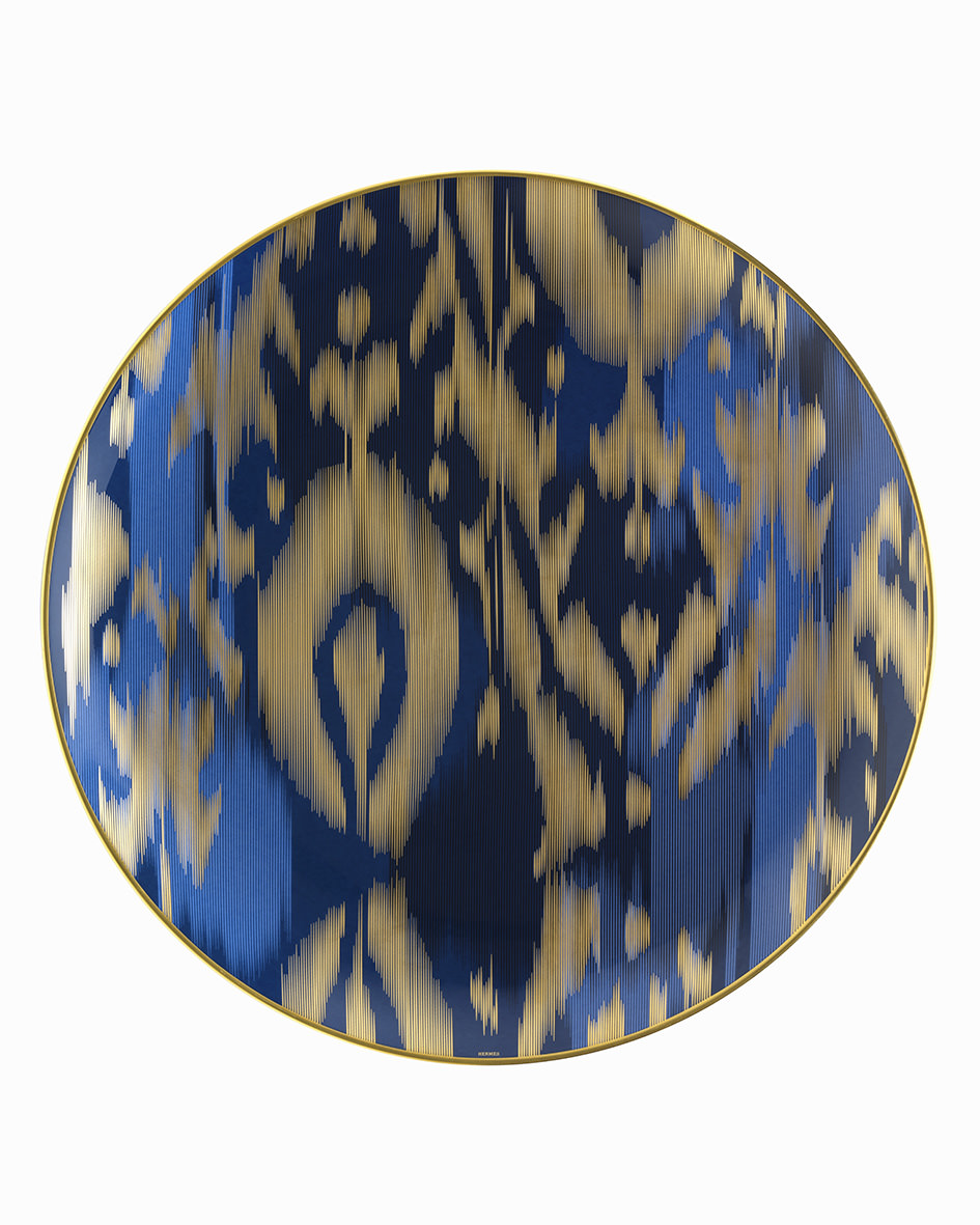
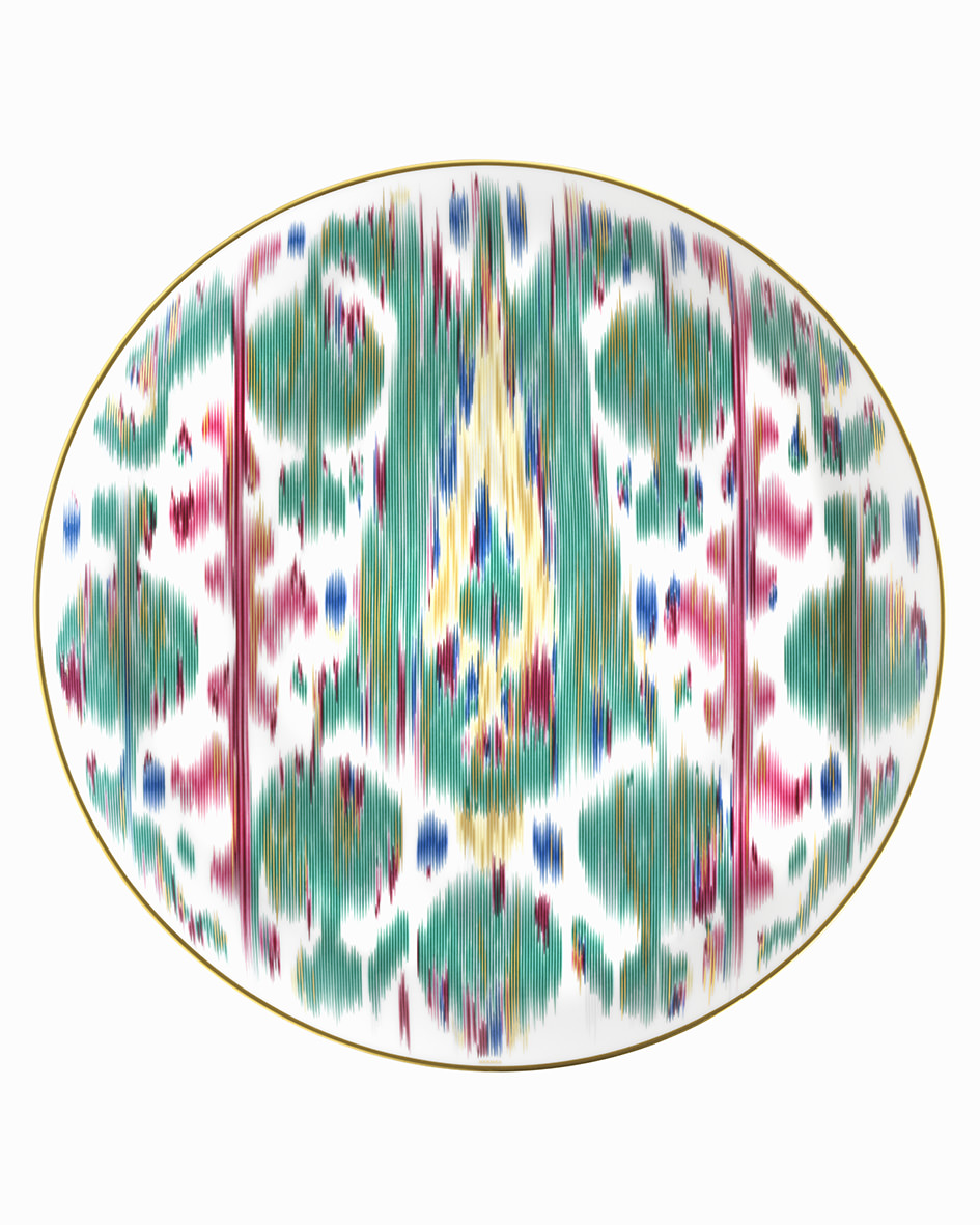
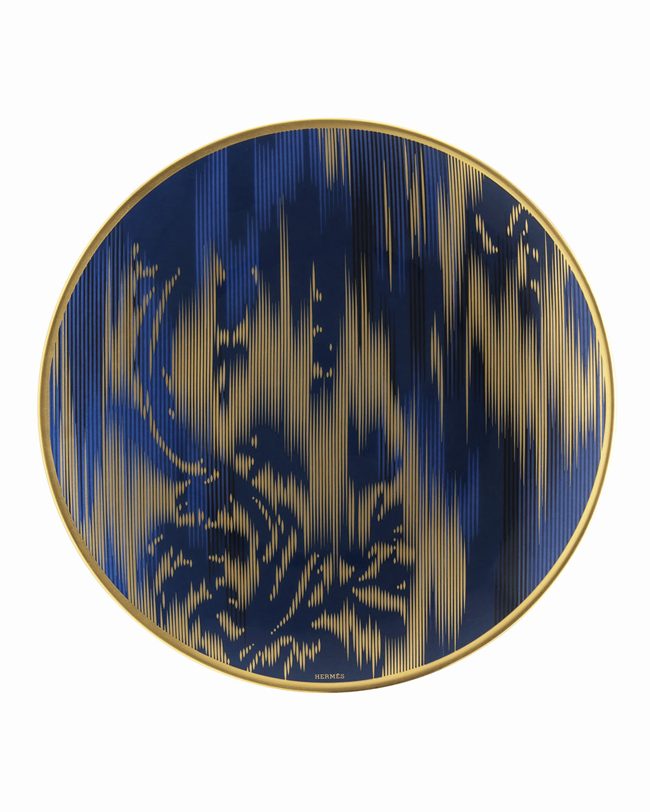
WW: The ikat porcelain collection is stunning. What attracted you to the ikat pattern? And how did you come up with the idea of putting a pattern only found in fabric on porcelain?
BPE: Thank you—that is very nice of you to say! Each time we embark on a new journey into a different visual universe. The initial idea of the project came from Pierre-Alexis Dumas, who had wanted to tell a textile story on porcelain for a long time, and especially a story about the ikat patterns which are unique, graphic, abstract, and timeless. I loved the idea from the very beginning, but I was concerned it was going to be real challenge. We wanted to develop a new ceremonial tableware collection with a contemporary approach, both in terms of design and patterns.
WW: How difficult was it to execute ikat on porcelain?
BPE: Originally, ikat is a weaving and dying technique from India dating from the sixth century. It has spread to all the corners of the world. To adapt ikat on porcelain was quite tough at first, as the colors work in a very different depending on if it’s applied on a soft material such as silk or on a hard material such as porcelain.
After several experiments, we started working in a similar way as with the weaving technique: line by line, yarn by yarn. We were able to almost get the same color vibration as you get when you look closely at a piece of fabric. In order to achieve the same color intensity and depth, we juxtaposed a soft pink link with an intense garnet red (as an example.)
Another challenge we faced was developing the decoration inside the bowls and the cup. It was a real technical challenge for the craftsmen. At first we thought the task would be too difficult and impossible to produce, but, finally, after various tests, we achieved it and we’re very proud of the result.
WW: What can you tell us about the color inspiration for this collection?
BPE: We wanted to express a journey through colors, abstract patterns, and a mix of influence from Western and Oriental cultures. The Silk Road was also highly present in our mind while we were selecting the colors for the project. We went through different archives and gathered inspiration from various ikat costume patterns. These patterns usually have a very strong color harmony, with emerald, sapphire, and ruby being the main colors of the collection. These colors evoke precious stones and ancient ikat costumes. We did add a complementary palette of soft tones in order to get a subtle harmony to complete the collection.
As a result, the “Voyage en Ikat” offers many different options for setting up your table. Depending on the occasion, you can play with the mix of colors and patterns and make your table spectacular and very colorful. Associated with a dark tablecloth (burgundy or dark blue), you can give your table a very theatrical atmosphere. Using a white tablecloth, you can organize the table with a much more monochromatic atmosphere, either in blue and gold or in ruby and emerald. No matter what color combination you choose, I would advise you to add flowers in one or two ikat vases of the collection in order to complete the setting and make it wonderful!
WW: Each piece has some sort of gold accent. Why was that something you wanted to bring in?
BPE: We wanted to find a balance between the very strong and colorful patterns of ikat that originally were found on the outside of the ancient costume worn by the prince and rich merchant. Historically, in the 18th century, the ikat fabrics and patterns were very popular in the royal court in Europe. In France, Marie-Antoinette was also a great fan of ikat. She had some fabric produced for her in Lyons by the silk makers who used a technique inspired by ikat called “chiné à la branche.” We wished to add this French interpretation of ikat in the collection. Thus we added this Western touch with the little gold details that are inside the bowls and cups for example.
The aim was also to develop a true “couture” collection, each piece having its own “costume,” its own decoration. We worked on two levels of graphic expression in order to reference the traditional ikat costume. The costumes often portrayed strong ikat prints on the exterior contrasted with small patterns on their interior lining. Overall, we wanted the “Voyage en Ikat” to be an invitation to an imaginary world, an expressive collection with a strong identity, assertive colors, and a hand-painted gold finish.
This article is published in Whitewall‘s fall 2015 Fashion Issue, out this month.