Kelly Wearstler’s world of design is an intuitive fusion of contrasts. Since launching her eponymous interiors and architecture firm in 1998, she has revealed the power of layering color, texture, and pattern by combining the bold and the refined, the historic and the contemporary. After taking the pulse of a site’s cultural and architectural history, she works with opposites to make it shine. The result has been a collection of award-winning spaces—from homes and hotels to restaurants and retail spaces. In addition, Wearstler has launched collections of home product across categories, while also maintaining partnerships and collaborations with Dior, Maison Margiela, Matchesfashion, Net-a-porter, and Louis Vuitton—as seen on her Instagram, @kellywearstler.
Kelly Wearstler on the Cover of Whitewall’s Winter 2024 Experience Issue
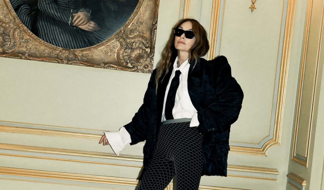
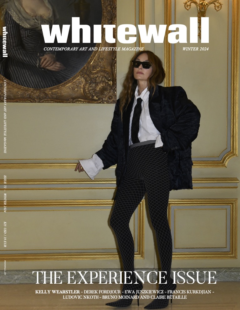 Kelly Wearstler on the cover of Whitewall’s winter 2024 Experience Issue, captured at Le Meurice in Paris, portrait by Jacques Burga.
Over the years, homeowners in New York and California, as well as hospitality clients in the Caribbean and Texas, have gone to the interior designer and her multidisciplinary studio for the same thing: her signature touch. Adventurous and refreshing, these atmospheres feel distinct and familiar, invigorating and functional. Visually, you know a Wearstler-designed space when you see it. Better yet, you recognize it when you feel it. That’s because it’s Wearstler’s intention to design a space that evokes emotion, hinging on both form and function, to nurture meaningful experiences. She also ensures that the local community is reflected in each project by enlisting local designers, engineers, artisans, and artists to create thoughtful site-specific work.
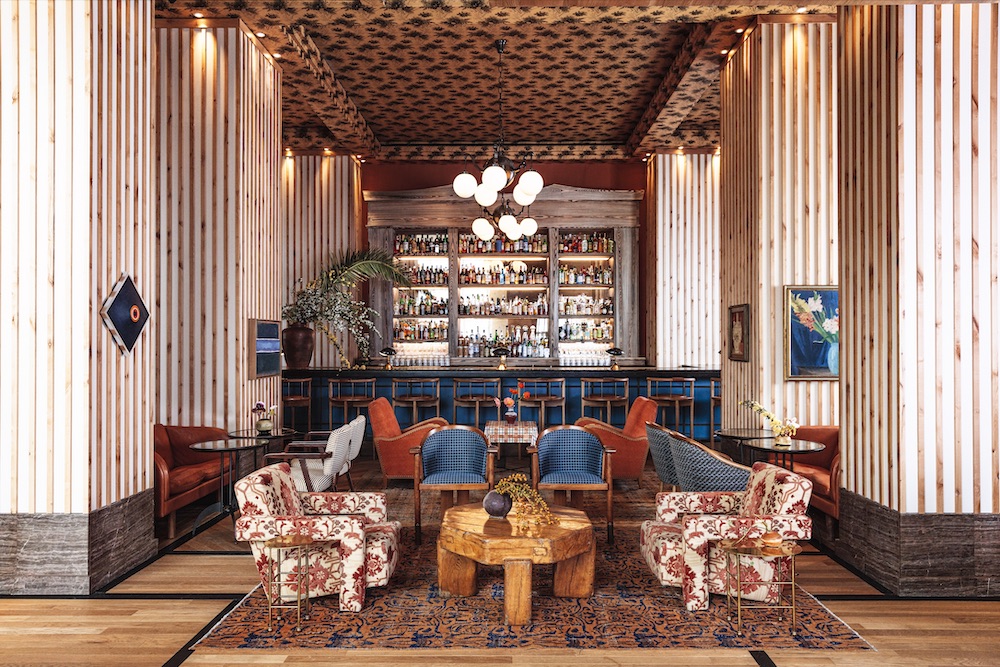 Austin Proper hotel, courtesy of Kelly Wearstler.
Most recently, we saw Wearstler’s magic unfold in her sixth book, Synchronicity. The Rizzoli-published title looks at three of Wearstler’s Proper Hotels interiors, as well as four residential spaces, to illustrate her collaborative and imaginative work in the field. One notable project highlighted in its pages is the Downtown L.A. Proper—a refined luxury hotel created within a former YWCA building, which Wearstler worked to both preserve and reimagine. Instead of filling a 35-by-12-foot indoor pool on the fourth floor, she designed a private suite around it, centered by an artwork. She commissioned the local artist, Ben Medansky, to create a specific tile piece above the pool, and decorated the rest of the space with a mix of vintage and bespoke furnishings.
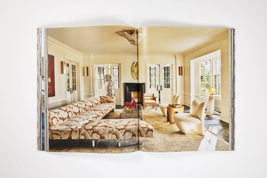 Synchronicity by Kelly Wearstler, courtesy of
Rizzoli.
Another one of Wearstler’s latest projects was creating a tabletop collection with the Belgian homeware company Serax. Divided into two lines, “Zuma” and “Dune,” it includes glassware and flatware in various colors and materials, including wood, ceramic, marble, and metal. Playful and surprising, “Zuma” focuses on the pattern, while “Dune,” a bit more architectural, zeroes in on the color, glaze, and shape.
Wearstler shared with Whitewall how beautiful tension, collaboration, and evolution are key to her practice.
“We look at what the story is,” —Kelly Wearstler
WHITEWALL: You design an array of spaces and objects—from hotels and homes to furniture and accessories. Where do you typically start with a project, regardless of scope?
KELLY WEARSTLER: We look at what the story is. For example, if it’s an architectural and interiors project, the story can begin with the building that has legacy, digging in deep there. If it’s new construction, it’s about listening to our collaborator, partner, or client about what they want to accomplish. We want to evolve and take everything to the next level. So we start with concept and the story. Then we continue into the schematic design phase, which is a lot of storyboards and work with 3D modeling and prototyping. I’m really involved in every aspect of the process.
WW: What is your studio like? Does the physicality of this space facilitate collaboration between teams?
KW: My studio is open-air, so there’s a lot of cross-pollination. For example, if we’re working on a hotel interior, we include the textile, furniture, and lighting designers, and create a lot of proprietary products for the project. We’re including all different departments, and the team is really learning from one another. It makes it special and unique.
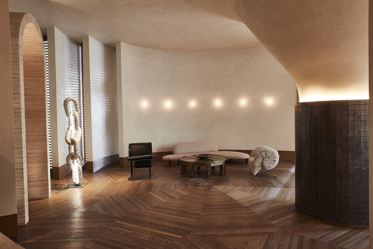 Santa Monica Proper hotel, courtesy of Kelly Wearstler.
WW: Collaboration is a very contemporary aspect of design today. How do you revert to a more traditional form of approaching design, like considering the site’s history or its architecture?
KW: We look at the heritage. Sometimes there are some great architectural details that we want to be inspired by, but also give a new spirit. Some of the projects that are new construction are some of the most difficult projects because we want them to feel soulful and evoke emotion. When everything’s new, it’s challenging. Some of those are more difficult than projects that already have a story and some sort of historic fabric that we can start from.
We always want to give it a new spirit and celebrate the past, but not re-create the past.
WW: How have you done that with your own space—your home in Los Angeles?
KW: I live in a 1926 Georgian-style home that has a lot of history. When we bought the house, we looked at a lot of historic millwork. And it was painted this sort of faux bois finish to make it look like wood. The colors were heavy. We sanded it down and studied what the inherent wood was in the millwork, and painted it a vibrant studio white and gave it a high-gloss finish. Now the finish on the millwork is reflective and it feels alive. We redid the kitchens and the bathrooms, so everything is new and modern, but we really want to look at the architecture and celebrate its heritage. I’m always looking to not erase what was there, but give it a new spirit.
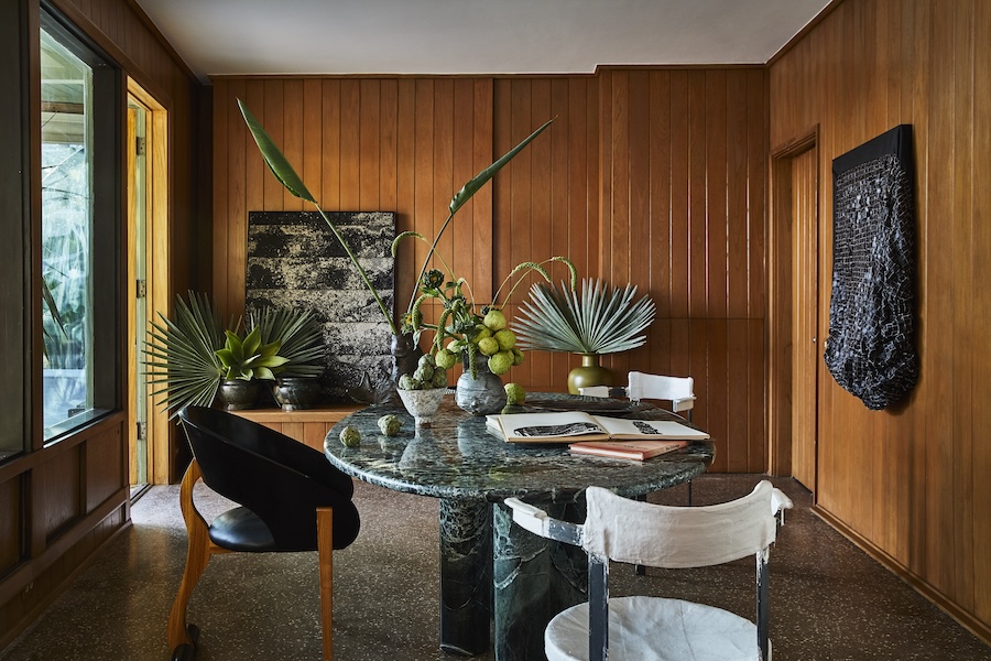 Malibu residence, courtesy of Kelly Wearstler.
WW: Using high gloss on old millwork is an example of your keen understanding of material. How do you know what a good pairing is? When do you know?
KW: It’s emotional. It’s intuitive. Some projects come along and feel so natural and evolve so beautifully. Others take time. For all our projects, we’re trying to find a solution. How do we make this look better? How can people function in the space better? Some projects, when finding the solution, are fluid and great. Others, you’re banging your head on the wall. But you know when it happens—it’s an emotional feeling. It’s like meeting your partner for the first time, saying, “Oh yeah, this is right.” It’s the same thing with design.
Creating Beautiful Tension to Design Something Fresh
WW: In your MasterClass video, you spoke about the importance of three design facets—color, texture, and pattern. What do you want to convey with the combination of all three?
KW: We’re always looking to create something fresh. Something that sparks emotion. It’s like creating a beautiful tension. If everything feels the same and has the same fine material, you don’t have any tension. It’s like having a dinner party and inviting all the same personalities. It’s fine, but it’s not as exciting as having a lot of interesting characters. It’s about finding that beautiful tension with all of those elements. That’s what we look at when we design a space—things that are vintage and contemporary, things that are experimental and interesting. It’s how I live, how I dress, and how I design.
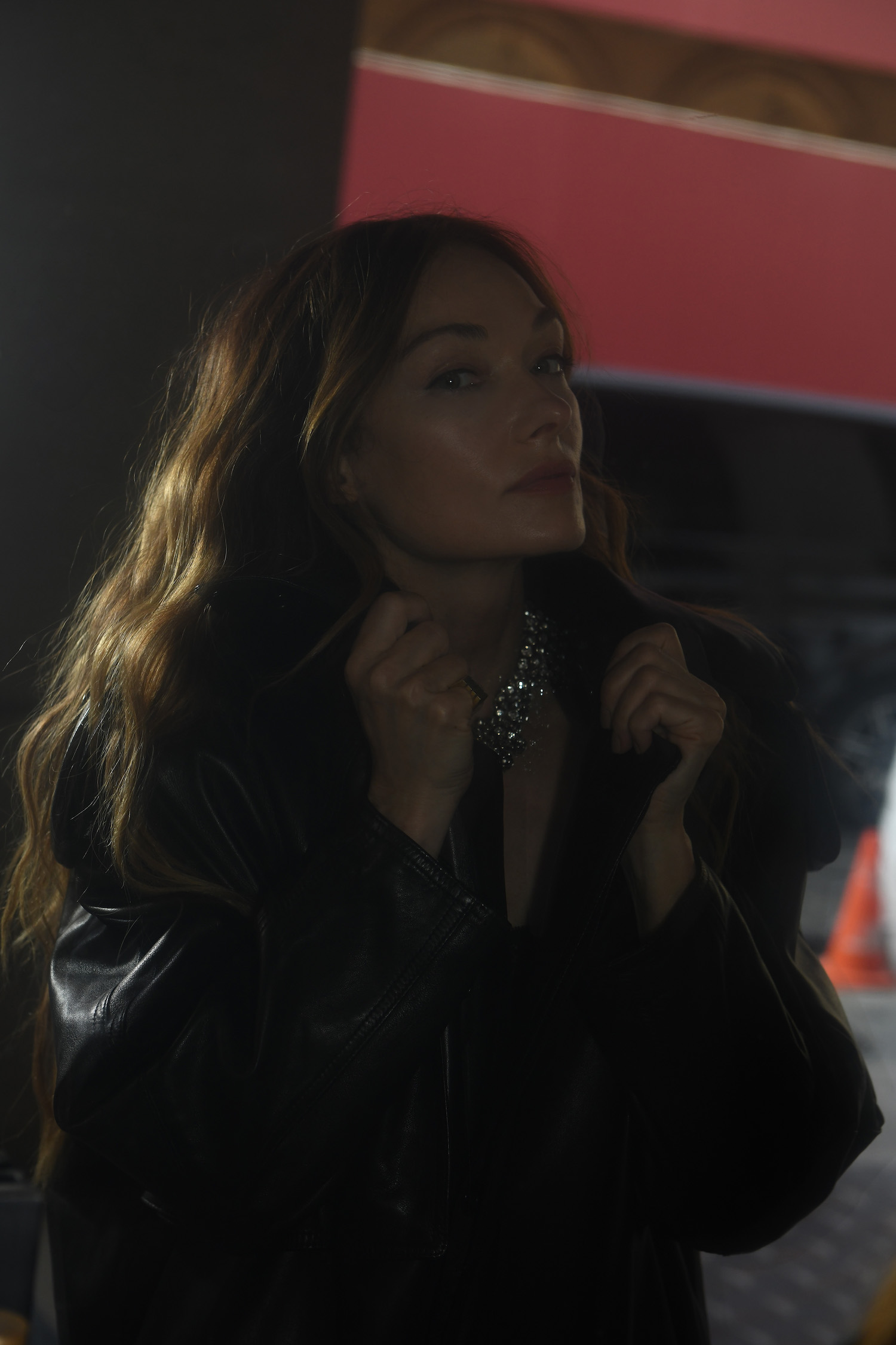 Kelly Wearstler at Le Meurice in Paris, portrait by Jacques Burga.
WW: We see that beautiful tension in the projects featured in your latest book, Synchronicity, which celebrates numerous collaborators you worked with on each project. How does it feel to see these spaces completed, and in print all together?
KW: When I think about working on a hotel project—you can have three to five hundred people, including tile installers, engineers, and operations teams—I think about coming together as one unit in one moment in time to create one beautiful work. You have to be in synchronicity. That’s where the title came from. Everyone has to work together. You’ve got to be highly communicative and learn from one another. That’s the beauty of every project. Whether from a client or an artist we’ve brought in for commission or the landscaper, it’s about learning. You get more seasoned, and the work evolves. And I’m all about evolving. It keeps it exciting.
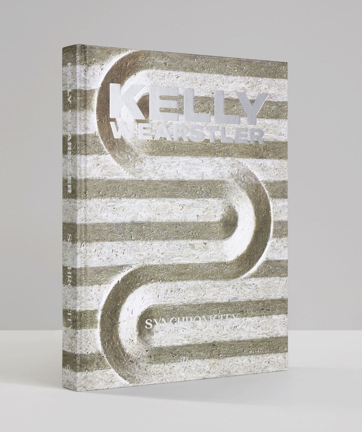 Synchronicity by Kelly Wearstler, courtesy of
Rizzoli.
WW: Synchronicity looks at three Proper Hotels and four residential interiors through this lens. Why these spaces?
KW: These are some of our latest projects, and we wanted to showcase a few that felt very different from one another. If you look at the one in downtown Los Angeles, it’s Spanish and Mexican—a historic building that was a former YWCA. There are all sorts of interesting things there. There’s a pool suite because there’s a pool on the fourth floor on the inside. To capture the historic tax credits, we had to keep everything as is. They also wanted to protect the legacy of the architectural design. So we designed a pool suite with a living room surrounding the pool, including a kitchen and a three-bedroom, which is really fun. There’s a lot of diversity in all of these projects, so it was about showcasing each one for the book in a special way.
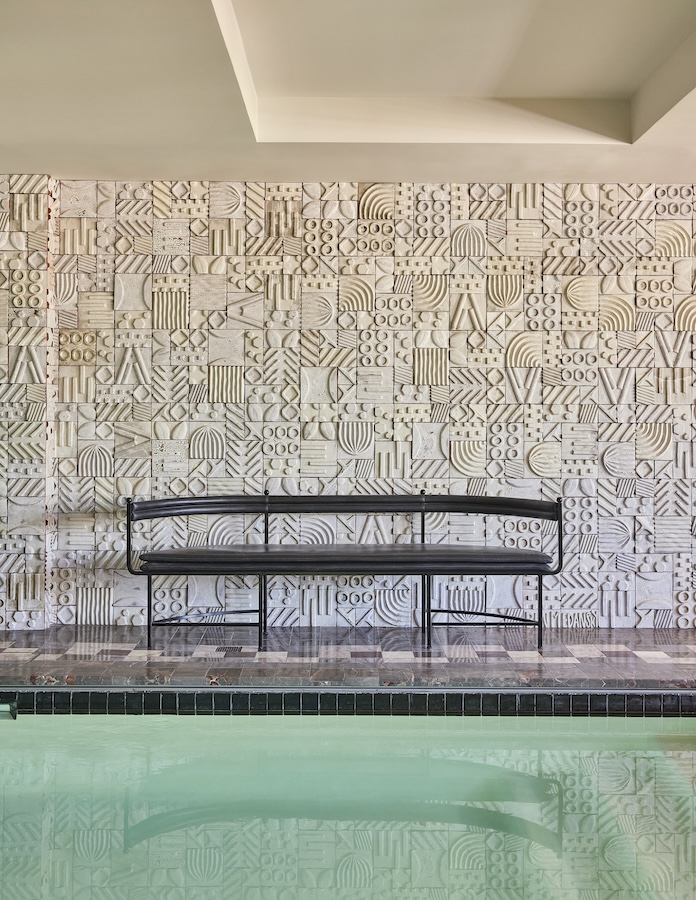 Downtown LA Proper hotel, courtesy of Kelly Wearstler.
WW: You recently debuted a tabletop collection with Serax, divided into two collections: “Zuma” and “Dune.” What was designing tableware like?
KW: It was a dream! I’ve always wanted to do this. With all of the hotels, we think about the food and beverage experience and what the presentation of the table is like. What the glasses feel like, what the tablecloth looks like; the candles, the lighting. Serax has great craftsmanship of product and has been specified for some of our projects, so they really were the perfect partner. We wanted the collection to feel like the California brand that we are. We wanted to have things that were also distinctive in the marketplace. We covered different materials, so there’s timber, ceramic, marble, and metal. There’s glassware and flatware. There are so many different combinations. You can continue to surprise your dinner guests over and over.
Kellly Wearstler Focuses on the Artisanal Hand
It was also about the artisanal hand. There’s texture and pattern, and architectural elements. The “Dune” pattern is all about architecture—very clean. It’s about the color and the glaze, and the refinement of the edges. “Zuma” is more playful, and it comes in three colors. It’s about the artistic hand of the pattern. They’re very different. The whole process was about two years. It was a fun collaboration and partnership, and we’re going to be doing more together.
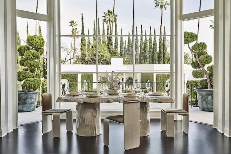 Serax x Kelly Wearstler, courtesy of Kelly Wearstler.
WW: Were there any references that particularly inspired large design facets, like material or shape? Or a fine detail, like the curve of an edge?
KW: Our glassware is ombre, and really takes cues from sea glass. The timber pieces are based off shapes of rocks you’d find in Malibu. They’re all a little different, and subtle with soft edges. They feel friendly. The stone pieces are obviously made from stone, showing the different texture and patterning in the pieces that are unique. All that comes together to create that beautiful tension I was mentioning in our interiors. It’s interesting to look at.
Serax is already a big provider to hotels globally, and we’re also in the hotel business. A lot of hotel chefs want to have clean dinnerware to serve their creations on—they prefer something a little quieter and understated—so we have something for them as well.
WW: Tableware is an intimate home object. We use it every day, but also when we gather together to enjoy food, celebrate, connect. How were you thinking about the consumer when designing the feel of these pieces?
KW: We wanted “Zuma” to be a little more casual. It’s the type of tableware you can have breakfast and lunch and a casual dinner on. There are three colorways, so it’s nice to mix them. All the colors work beautifully together. “Dune” feels more elevated and clean—even a bit more serious. It’s great for entertaining and for the hospitality experience.
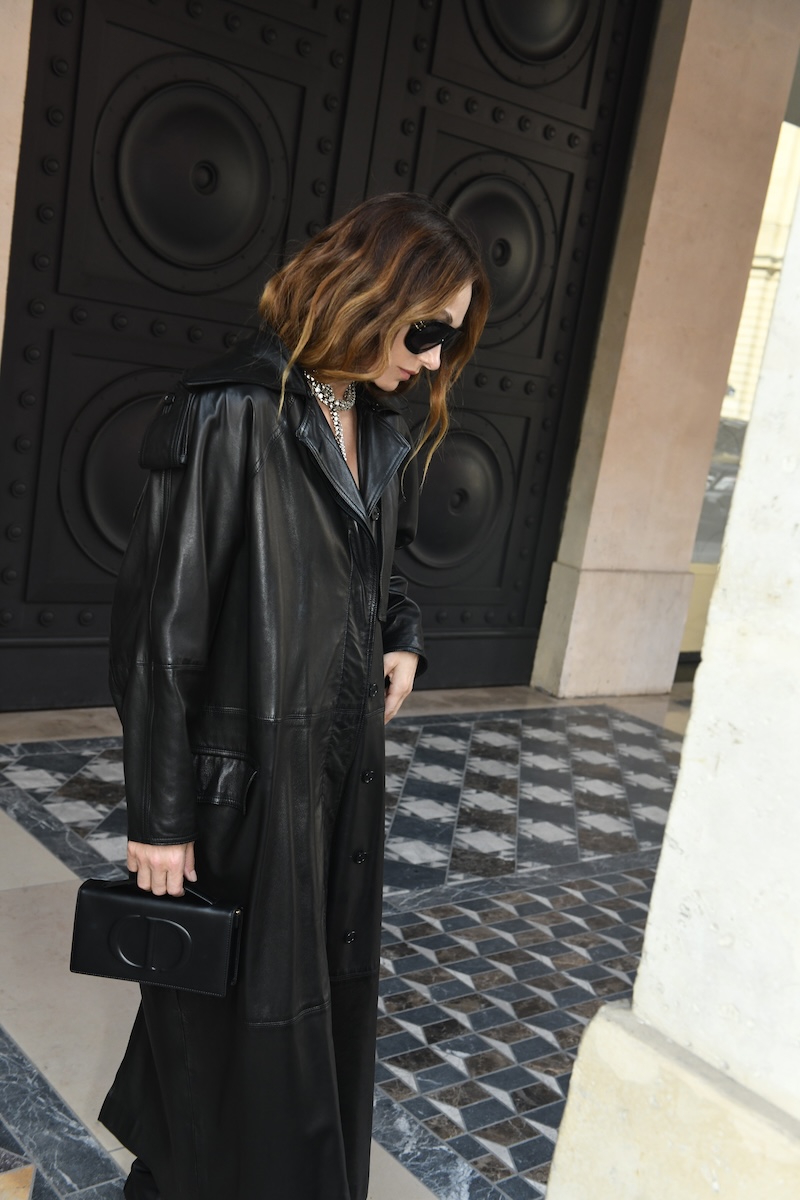 Kelly Wearstler at Le Meurice in Paris, portrait by Jacques Burga.
WW: Another intimate design feature in a home is art, from paintings and sculptures to furniture and fine objects. Of what significance is its presence in a space?
KW: Many clients already have or are working with an art advisor. They have them on as a team player. Art is one of my favorite parts of my practice, whether it’s inspiration or commissioning an artist to do something specific for a project. It’s something that the project would call out for, whether we need a functional work of art like a cabinet or something within their existing collection. Clients love commissions because it’s something made specifically for them. It’s much more meaningful and thoughtful.
We also might need something for a focal point. We’ll work closely with the art advisor and say, “We have this really special moment. Who were you thinking about?” It’s a collaborative effort across all parties, even with the landscape architect. If we want to create a vista outside of a window that speaks to the interior and work as one experience, that’s also something we consider.
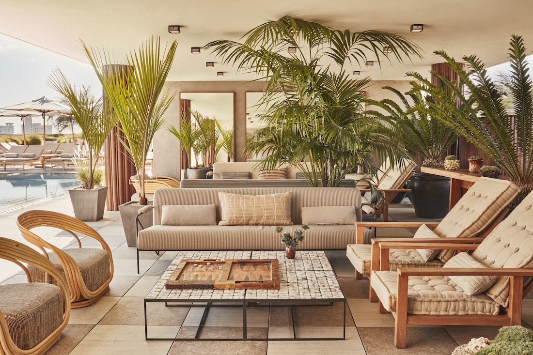 Santa Monica Proper hotel, courtesy of Kelly Wearstler.
WW: What has been a recent commission that’s been particularly exciting for you?
KW: One that was really unique and interesting was the pool suite we did at the Downtown L.A. Proper. We worked with this ceramic artist, Ben Medansky, and he created an 80-foot wall of tile for the hotel suite and the backdrop of the pool. It was amazing, and quite expansive. And he’s a local artist! With our hotel projects especially, we embrace and celebrate the local craft and talent in each city by bringing it to the hotel. When someone visits a hotel, they obviously want to feel like they’re in that city, and we want to inspire and support local artists, whether they’re emerging or established.
The whole hotel project took about three and a half years, and Ben worked on that for a solid 18 months. There was a lot of prototyping and creative process that went in on the front end of it.
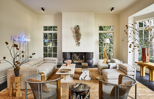 Marlboro residence, courtesy of Kelly Wearstler.
WW: You’ve worked with artists on other projects, including another local one—the Proper in Santa Monica. How did you arrive at working with Kelly Lam?
KW: She did a few projects in Los Angeles, where she used these big monumental links made of bronze. And when I saw them, I was like, “We should do a light sculpture in the lobby!” So I reached out to her, and she was amazing to work with. And it looks like a chain link from a boat, so it has this maritime feel.
“I’d say I’m a free spirit,” —Kelly Wearstler
WW: What work are you typically drawn to?
KW: I’m drawn to anything that speaks to me. It could be an emerging artist, or someone more established. I’m super open—I really like it all. It’s an emotional feeling, so it could be something I’ve never seen before, which also gets me really excited. Seeing something new gets your heart racing. It gets you all fired up and inspired. I’d say I’m a free spirit. I’m so open.
 Serax x Kelly Wearstler, courtesy of Kelly Wearstler.
WW: Do you feel the same openness in fashion?
KW: I’m so open! That’s why I love emerging designers. They’re more experimental, and I’m kind of playing. I might put on a crazy outfit that looks bad, but I’m having fun and taking risks. Sometimes, there’s a hiccup. [Laughs] But that’s what’s fun! You have to experiment. I love trying new things. I also love vintage. I usually always have something emerging, a classic brand, and something vintage on—whether it’s denim or a vintage T-shirt or a bag that I got from a cool resale shop. I’m always open to exploring.
WW: How did working with artists and craftspeople on projects lead you to creating a gallery platform of your own?
KW: When we’re working with artists for some of the residential projects, people would come into the hotel saying, “I love this work of art. This pot. That table.” It occurred to me that people wanted to get in touch and get that piece, or find something similar. These were works that we partnered closely with an artist on, looking at their materiality and their voice, and the functionally that we may need for the space. But I saw there was a need. It was an authentic, evolved element to my business.
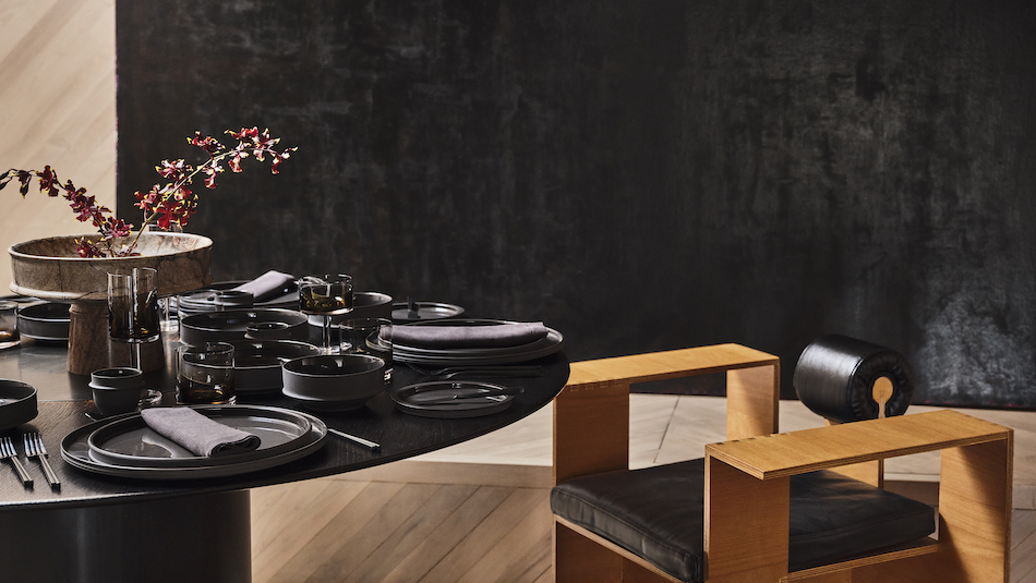 Serax x Kelly Wearstler, courtesy of Kelly Wearstler.
WW: You’re continuing to work with different artists. What’s a recent example?
KW: I was just in Rotterdam. We’re doing a few collaborations with some emerging artists there that will be on the Gallery platform next year. We’re celebrating them and supporting them, but only having a few unique, specific pieces that I offer at the Gallery—and that’s the only place you can get them. A lot of galleries carry a lot of the same artists’ pieces. Here it will just be unique works that we came together to create. It’s great because they’re also really thoughtful about sustainability and recycled materials, and looking at technology and sustainability coming together.
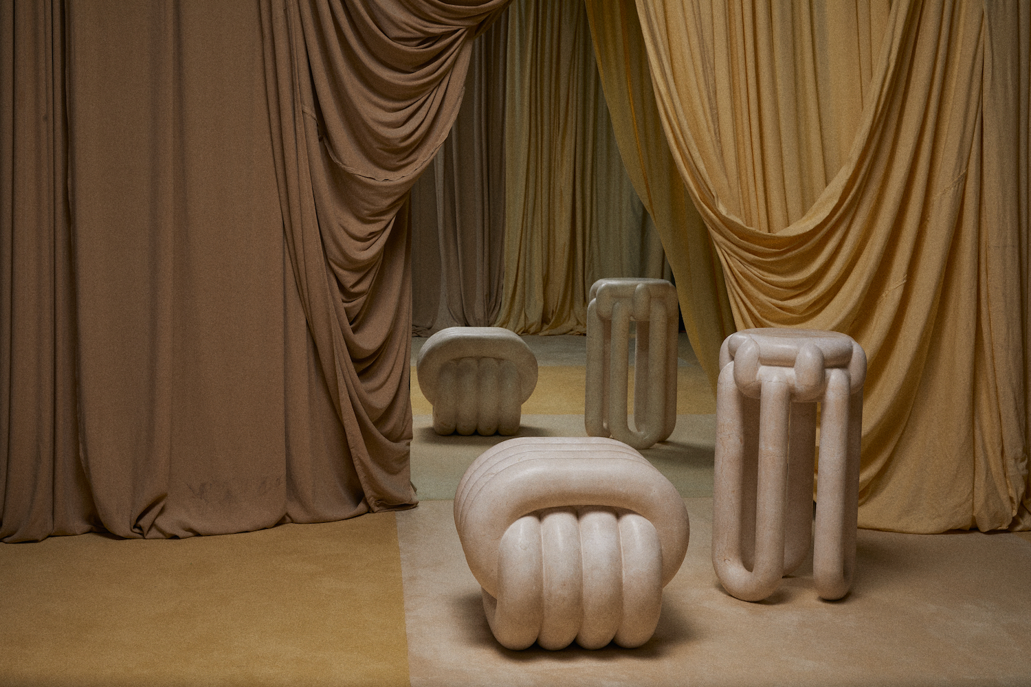 Installation image of Kelly Wearstler’s “NUDO” collection, photo by Nick Hudson.
WW: How are you thinking about sustainability in your practice right now?
KW: Because we’re in California and already have strict guidelines for our projects and construction, we’re ahead of the game. We’re thoughtful about that, and we really follow the rules. I’m also involved with the University of Texas, where I speak. After one of my lectures, a girl came up to me and asked, “What are you doing in sustainability? You should have someone on your team that focuses on that.” I thought it was a great idea. So at the beginning of 2024, we’re bringing in somebody. There will be one person, just her, but it’s a good start. We’re going to look at all of our departments and see how we can be forward-thinking on how to protect what we have, and apply that to the different departments.
That’s what is great about going to these colleges. When she asked that, I thought, “That should have been something we’ve done!” But it’s about being open and receptive. Like the interns we have at our studio for the summer, we learn from them.
WW: What else are you learning from the next generation?
KW: The way they think. They’re wide-eyed—and this is how I am! I always want to do something new and explore, and have an open mind. That’s how you evolve. And they’re all about exploring. That’s why we have great internships and apprenticeships at the studio, because they want to be in a forward-thinking studio and have their voice heard, which I think is really important.
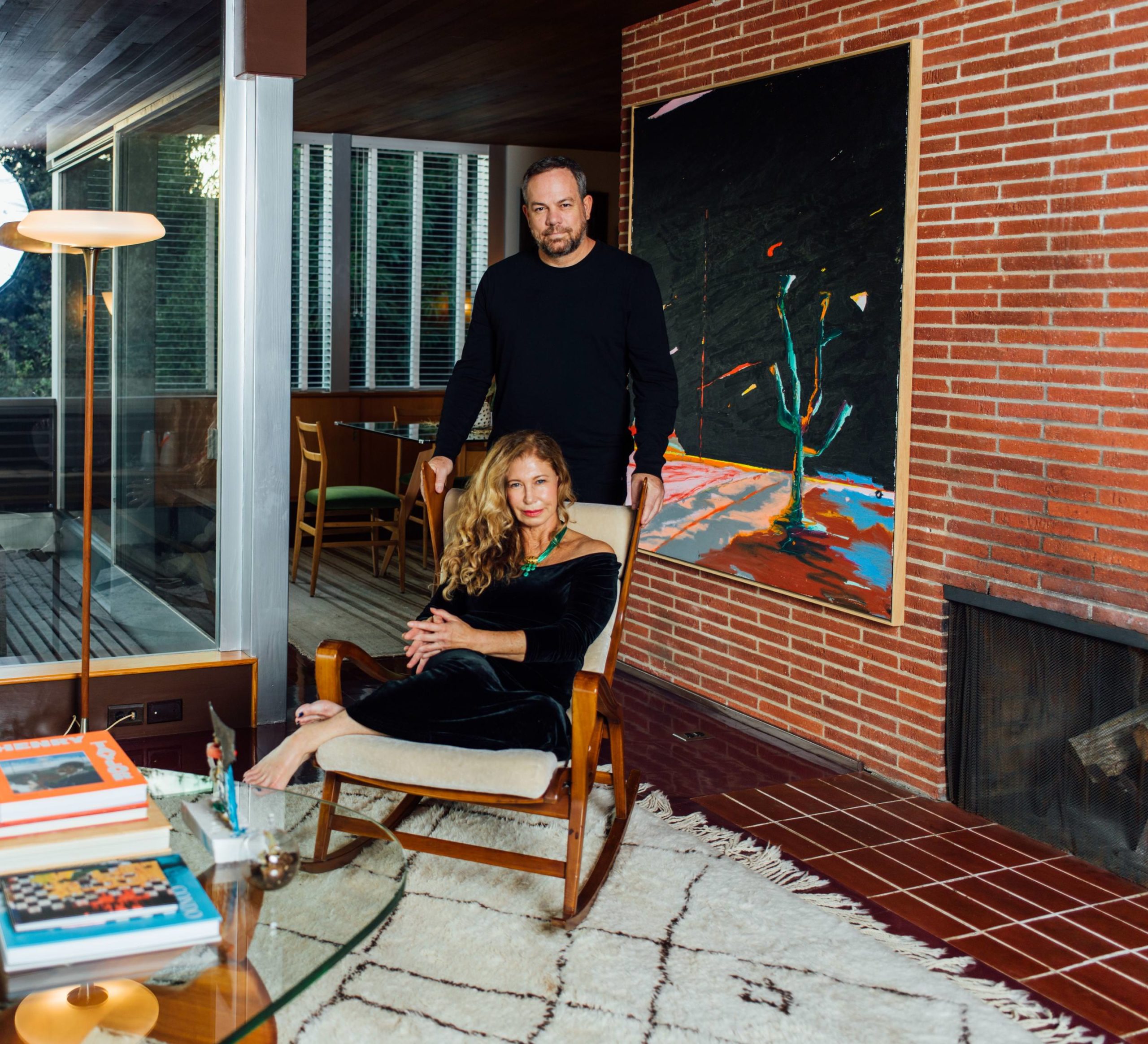
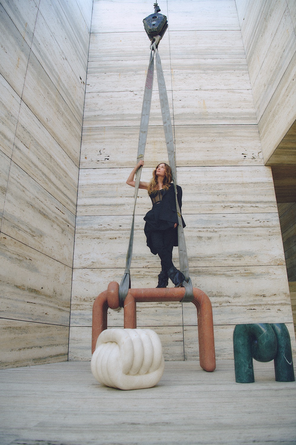 Kelly Wearstler at ARCA’s Guadalajara Showroom, photo by Harper Smith.

