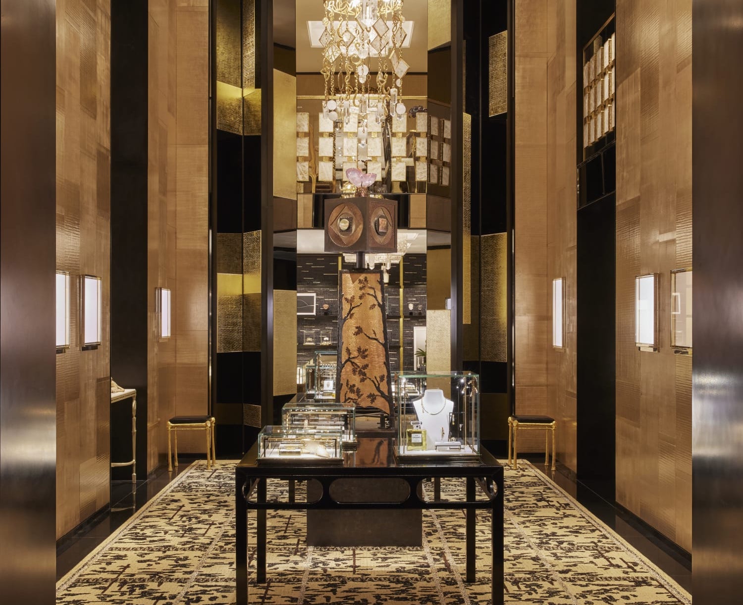
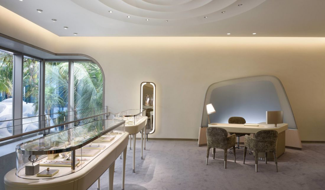
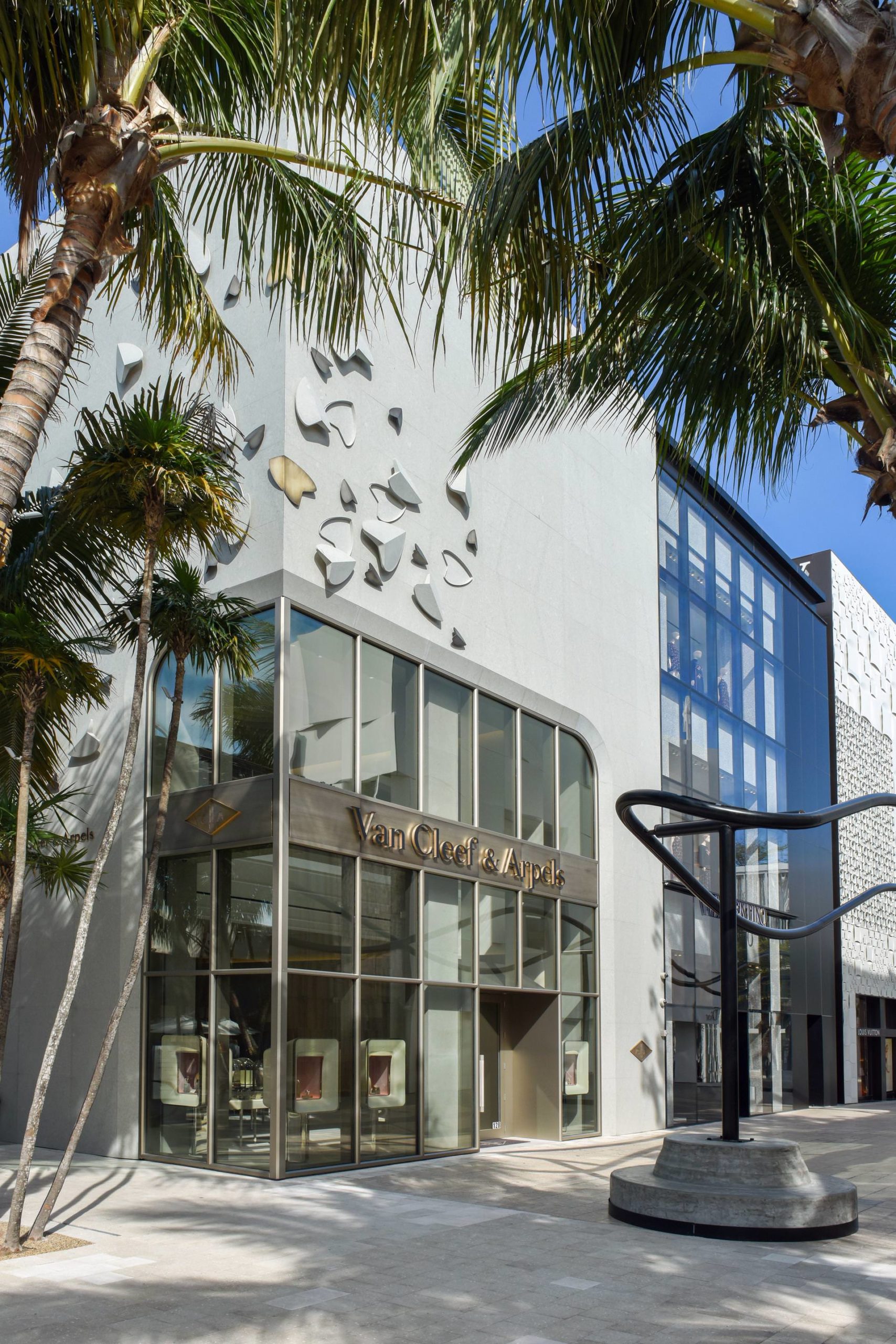
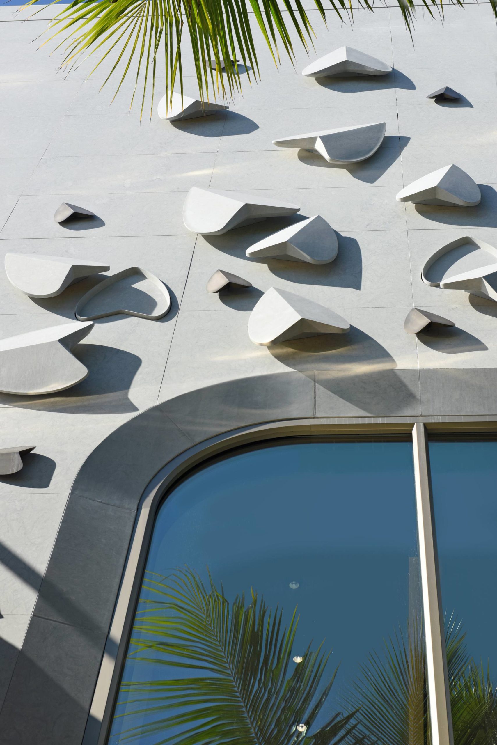
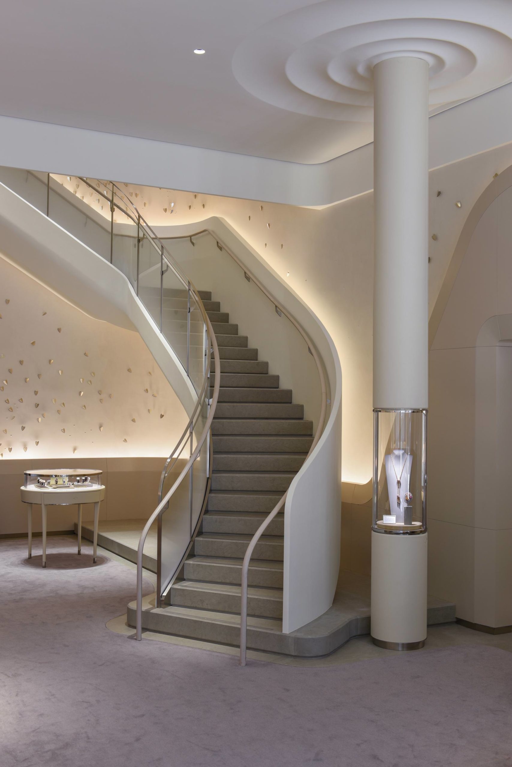
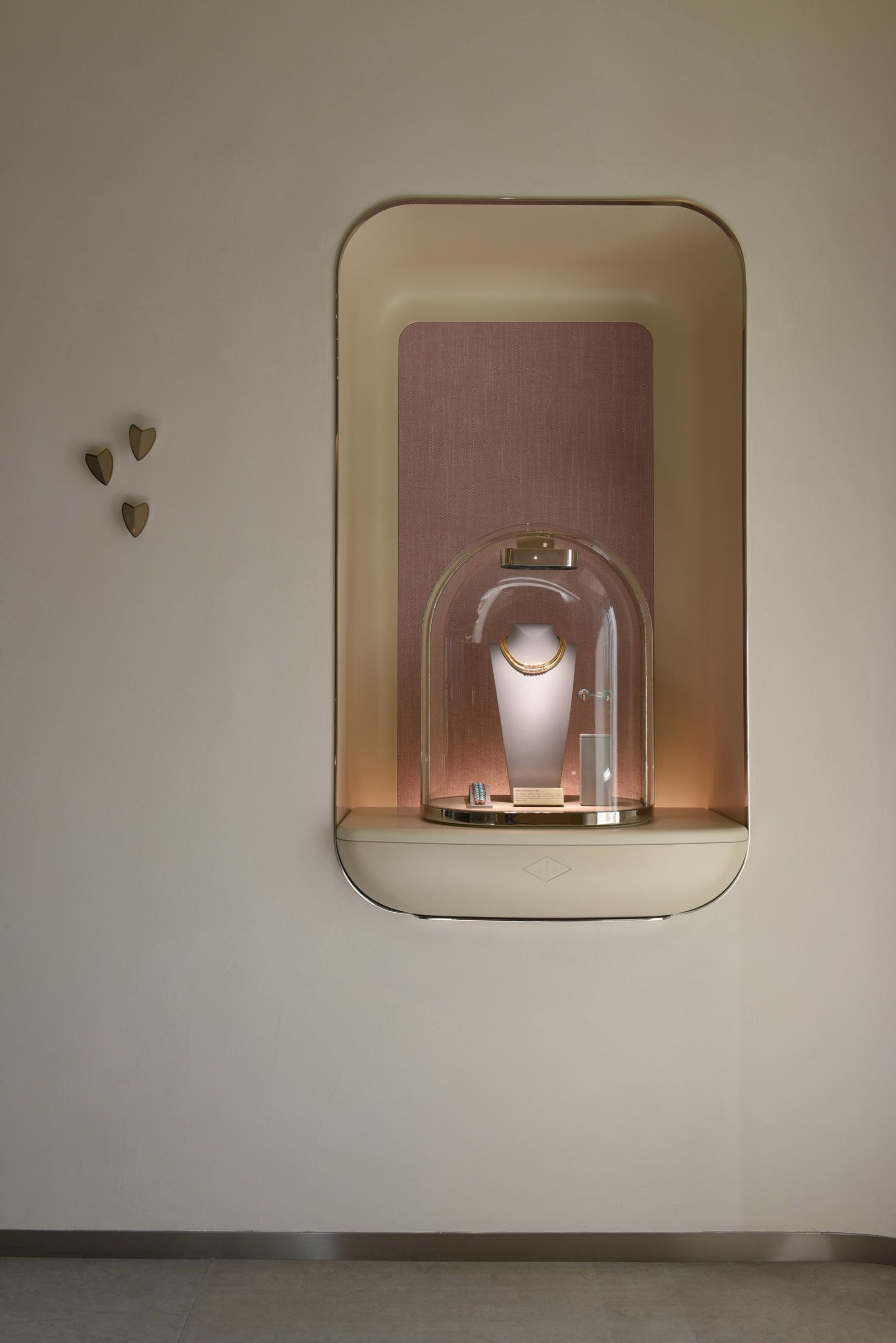
Earlier this year, Van Cleef & Arpels opened the doors to its light-filled boutique in the Miami Design District. Its facade is accented with a sweeping swirl of leaves that continues as a motif throughout the interior. The ceiling is textured with concentric ripples, like those on the surface of a reflection pool. Towering columns double as display cases for flora- and fauna-inspired jewelry collections.
Jouin Manku agency designed of the space, headed by Patrick Jouin and Sanjit Manku. The duo have been behind several of the jewelry house’s boutiques, as well as many of its exhibitions’ scenography. Whitewaller asked Manku about creating something unlike anything they’d done before.
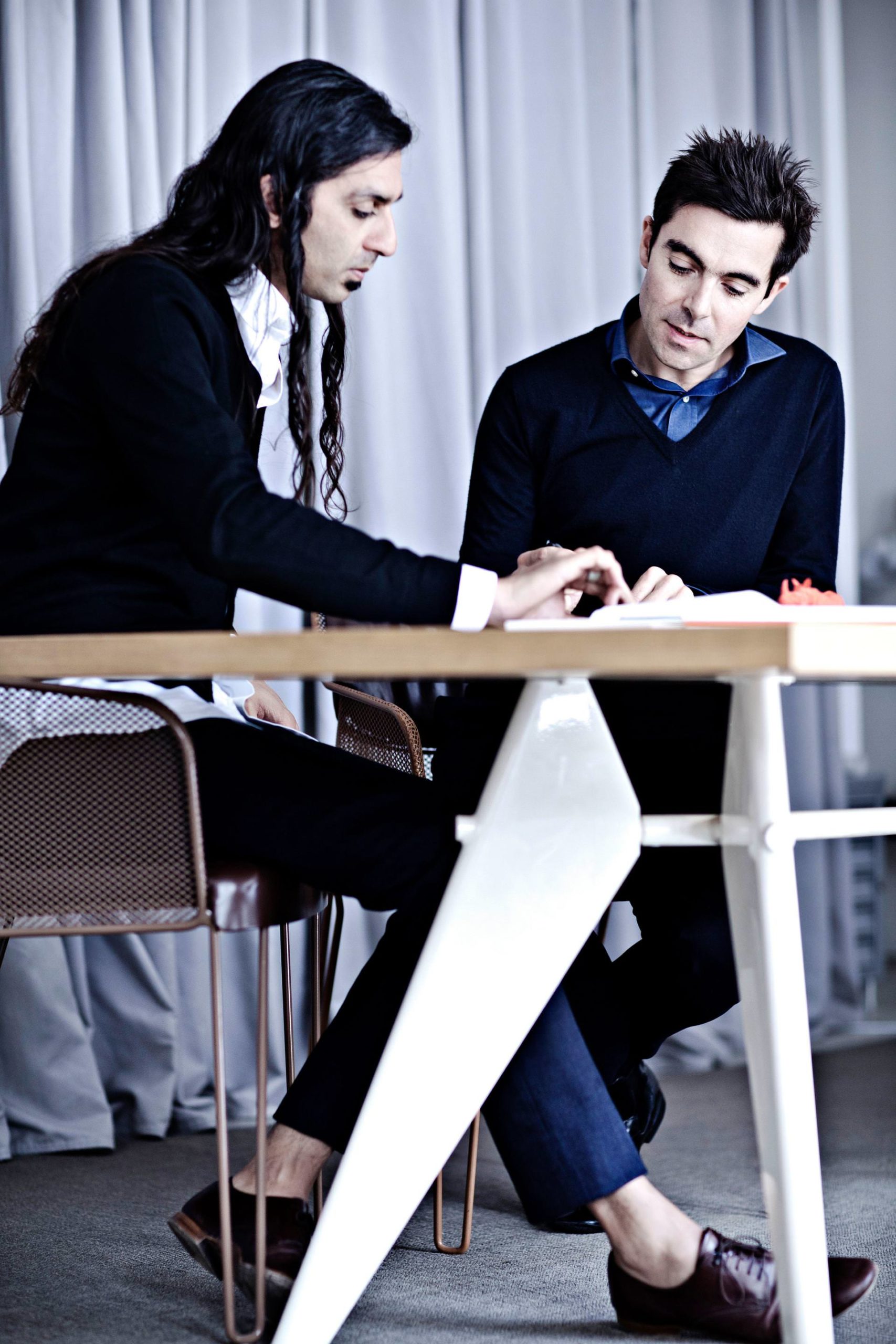 Photo by Benoit Linero.
WHITEWALLER: How did the location of Miami influence your approach to this boutique in the Design District?
SANJIT MANKU: The influence was Miami and the character of the Design District. On this project Nicolas Bos, the CEO of Van Cleef & Arpels, gave us the brief to do something that was part of the world of Van Cleef & Arpels, but at the same time, unlike anything else we had done. We were not making a maison, nor were we making a standard shop. This was something different. So we played with volumes, as well as the Art Deco history of South Beach. We did this in form, but kept it all very white and bright. A bit of crisp Paris.
 Courtesy of Van Cleef & Arpels
Then we added a light layer of color, as we also wanted to play with the colors you always associate with Miami. The famous Miami Vice turquoise and pink. Formally, we liked the rain of Miami and the associations with water, so we threw that into the blender as well. The result is unlike what we have done for them in the past. It is pure but emotive. It also is a bit more fun.
WW: What kind of atmosphere did you want to create to showcase the collections?
 Courtesy of Van Cleef & Arpels
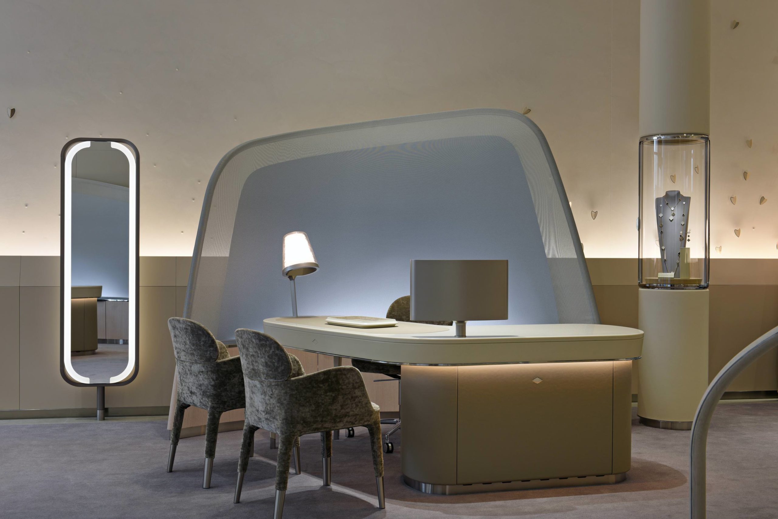
SM: We interpret the Van Cleef & Arpels work as very dreamlike. A place that is in contrast to the external world, yet still feels harmonious and not just contradictory. We are searching to evoke a sense of playful wonder. The hard part is creating this kind of environment and still keeping it feeling comfortable. It’s not your home or your hotel, but you still want to spend the afternoon there and you don’t know why. That is the real work, I believe, of interiors.
WW: The columns, acting as both a design element and display, touch the ceiling, creating a ripple effect. Can you tell us about the idea behind that?
 Courtesy of Van Cleef & Arpels
SM: The space was fantastic. It was so vertical. We wanted to play with the verticality—stretch it out and make it a key element. But then the issue is always how do you end it? Here they plunge into pools of plaster that ripple above you. The rest is very simple. There are just a few key elements. Some are logical; some are purely emotive.
WW: We remember visiting the exquisite Van Cleef & Arpels exhibition you designed back in 2011 at the Cooper Hewitt Museum in New York, “Set in Style.” What is it like having this kind of ongoing relationship with a historic jewelry house?
 Courtesy of Van Cleef & Arpels
SM: It is an honor and a privilege. It allows us to push each other further with each collaboration. It allows us to question each other, challenge what we have already done, and play in the sandbox together. Each time, the process is a very precious one. It is rare, I think, in this day and age, to have so much fun and trust with a client. We are in the age of disposability. No one wants to hear that a collaboration is still going on. No new news there. People want change, and they want it fast. So this kind of work together is astounding. We still reinvent ourselves at each new project, but I think the body of work we have done with them makes a strange encyclopedia of astounding moments and spaces.
 Courtesy of Van Cleef & Arpels

