The day before Valextra’s Fall/Winter 2017 collection “Toothpaste” debuted in Milan, we jumped on the phone with the brand’s CEO, Sara Ferrero, and Bethan Laura Wood. The British designer was invited to collaborate on the new collection—a second-ever venture for Valextra. “Toothpaste” offers seven new handles, four new clasps, new pockets, and the biggest shocker for those that know Valextra well—lots of color. We chatted with Ferrero and Wood about design choices, endless inspiration, and living in a colorful world.
WHITEWALL: Bethan, you explore the relationships we create with objects in our everyday lives and question how they can become cultural conduits. How do you feel a handbag does this? How is this Valextra bag doing that?
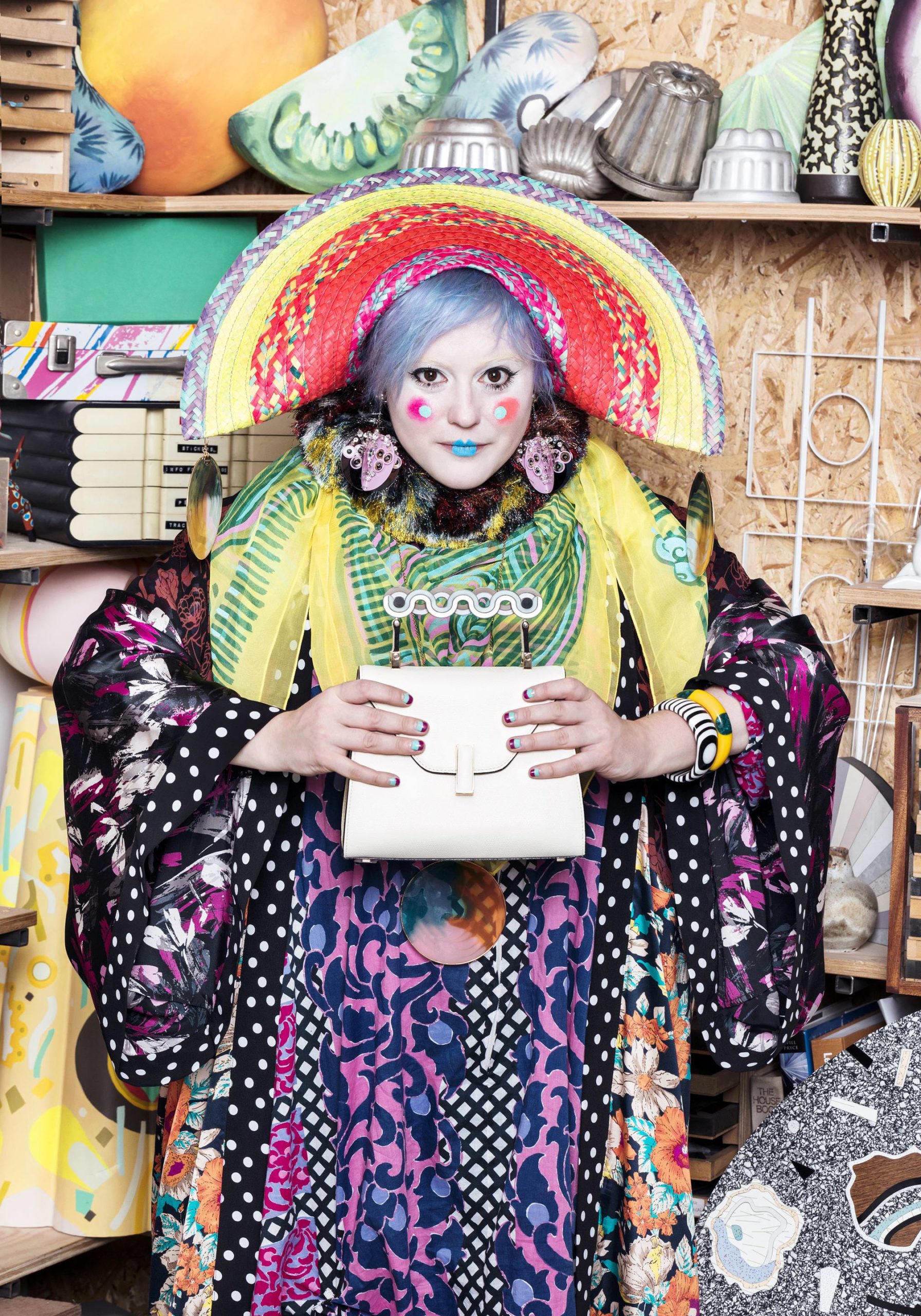
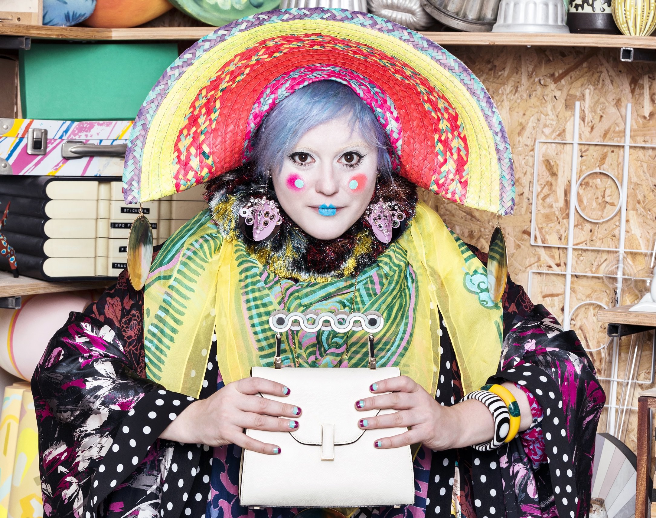
Bethan Laura Wood.
Courtesy of Valextra.
BETHAN LAURA WOOD: A handbag is a really interesting object. It’s a very public-private object. It holds a woman’s deepest, darkest secrets, and it’s a go-to when she’s out and about. It’s an object that’s strongly bonded to the owner, so I think it already has a deep relationship. For my collaboration with Valextra, I wanted to have an element where there are different details and combinations. Some of them are very quiet combinations, and some of them are a bit hotter. I like the idea that for different people’s personal style, and things that they love, they will find a combination and a shape that suits them best.
WW: Can you tell us a bit more about the modular system that you invented for this collaboration?
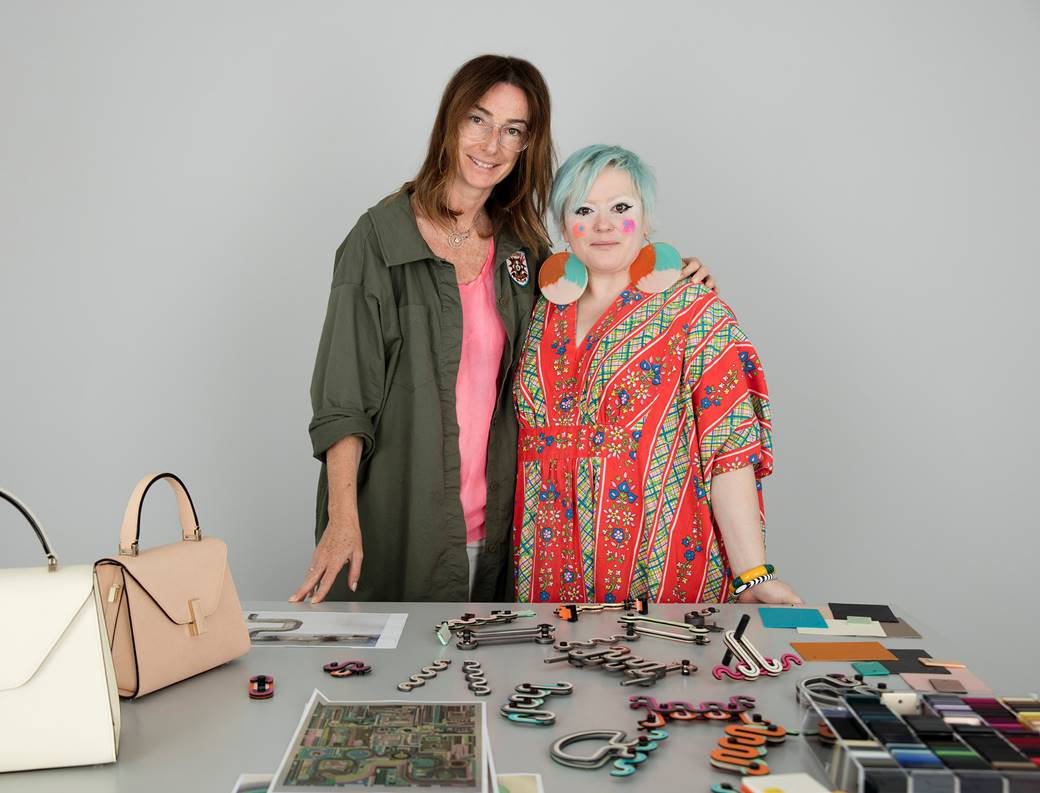
Sara Ferrero and Bethan Laura Wood.
Courtesy of Valextra.
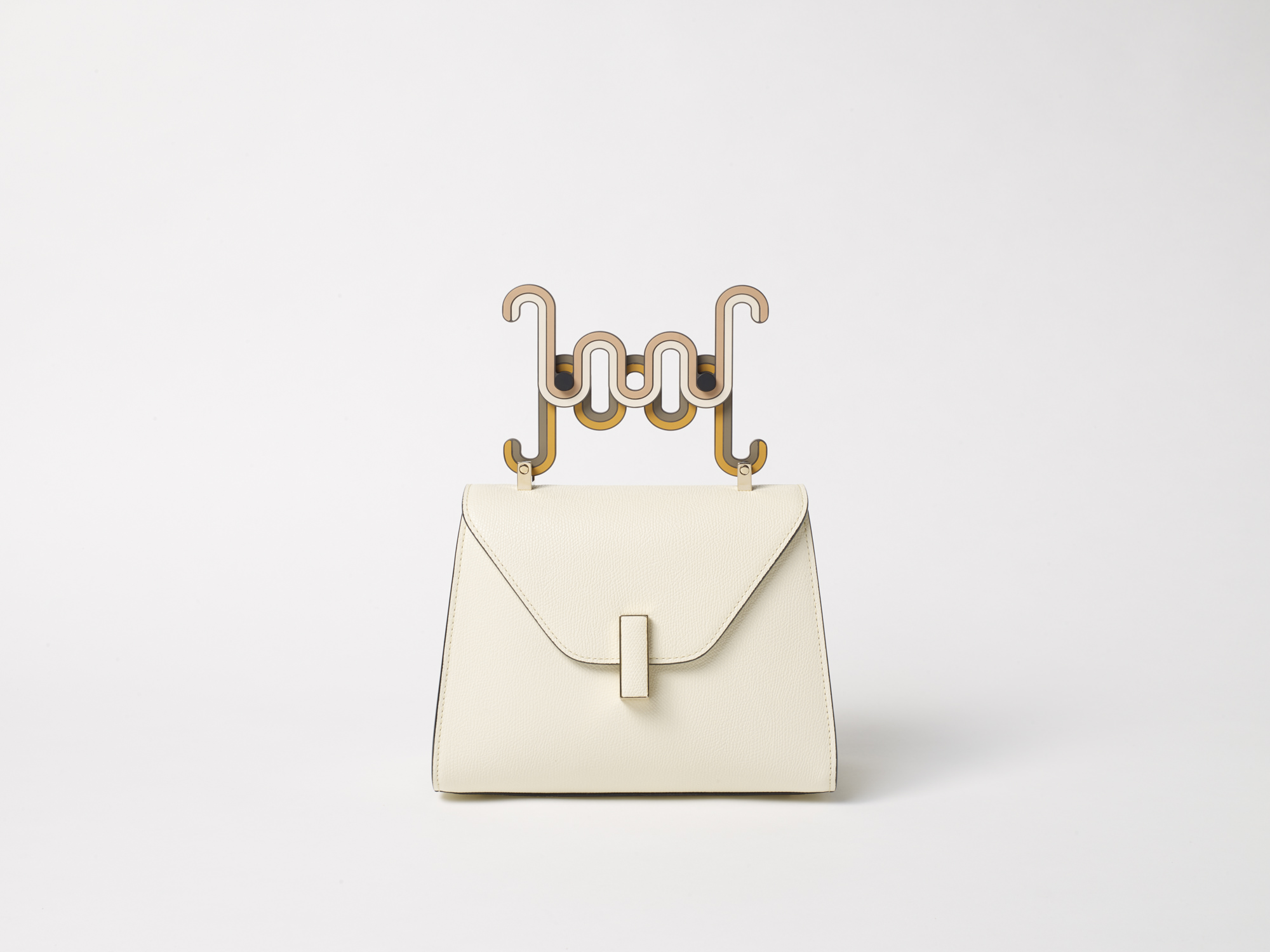
BLW: It started with the idea of just getting from A to B. Working with the existing bags, which has six settings on it, I was just playing with how to get from one point to the other. And then I just started to break that distance down to give myself a stop point and a rhythm that worked in that space. In that, I built a set of curves and stripes that you can combine—based on the same rhythm patterns—to get from A to B. The design of the handles and the purses is based on a modular system, and it all works with a curve and rhythm.
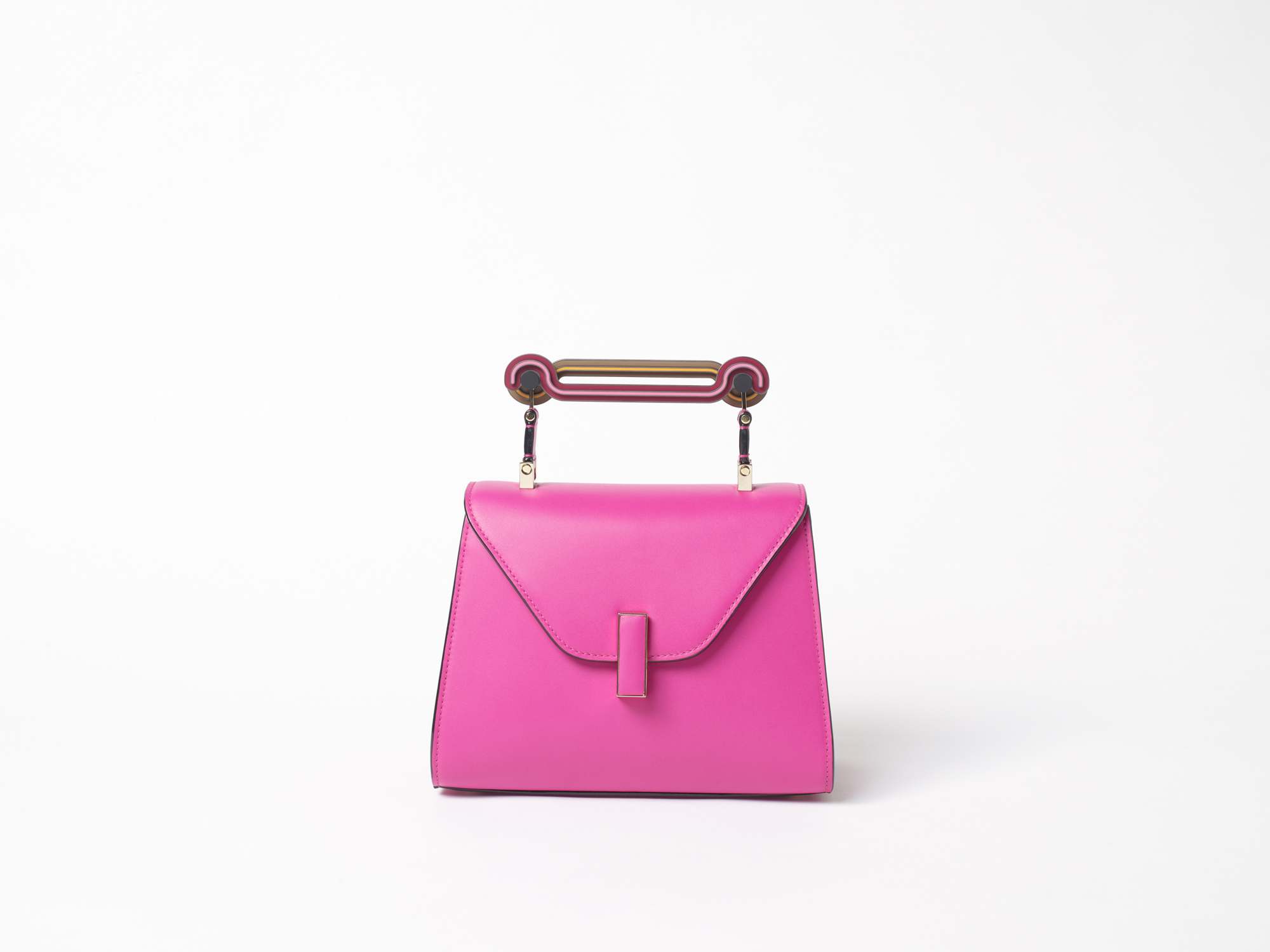
WW: You also said “Toothpaste”’s aesthetic was “somewhere between Neapolitan ice cream and your dad’s 1970s ties, mixed with a bit of mint toothpaste.” It’s a wonderful swirl of colors to see altogether. How did you arrive to the point of putting these colors together?
Courtesy of Valextra.
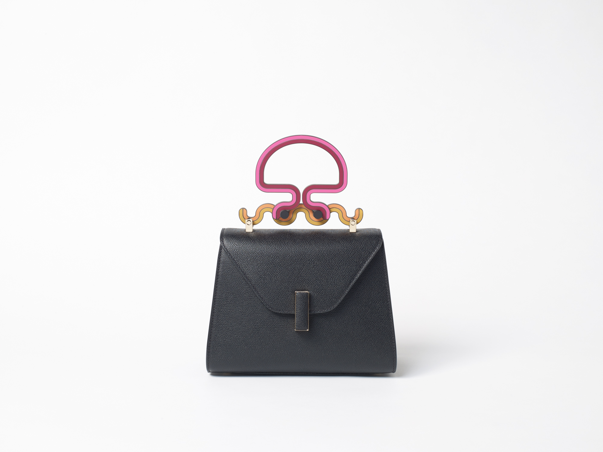
BLW: It mainly started by looking at the colors of the bags in this season that I was invited to collaborate on, and then breaking them into groups that became really interesting or started to remind me of something between the industrial and the seventies worlds, which linked really well. There are combinations in there that are very “ice cream,” but because all the handles are two components that talk to each other (one may be “ice cream” and one may be “1970s tie”), you get this really wonderful flavor when you join the two.
WW: Sara, when were you first introduced to Bethan and her work? Why was this partnership something you wanted for Valextra’s new collection?
Courtesy of Valextra.
SARA FERRERO: We’ve known Bethan for quite a long time. Her work is exquisite, as is her strong personality. She’s incredibly detailed, dedicated, and loves what she does. And what comes out is beyond expectation. Her soul is something intangible that she puts in, and it comes out in the product. It’s the magic that she manages to infuse in the product. It’s phenomenal.
WW: Tell us a bit about the large-scale, heavy hardware that has transformed the Milan store space into a postindustrial environment to enhance the pieces.
Courtesy of Valextra.
SF: On one side, the inspiration of Eduardo Paolozzi and these big installations of industrial tubes that he put around London, which were very powerful and very beautiful. We also loved the contrast of the beautiful lines and sophistication of the handles done by Bethan. There’s an element that is very much Valextra—hardness and softness— and we like that contrast. The tube that goes around the showroom is in all of the sophisticated colors of Bethan’s collection. There’s the contrast of industrial and laborious, but also soft and beautiful. It’s a journey. We also see “Toothpaste” as a journey that is made of curves and turns, but it always goes in one direction: forward. That’s our hope, for us and for the world, that despite all of the curves that we may go through, we go forward in a better world. With color.
