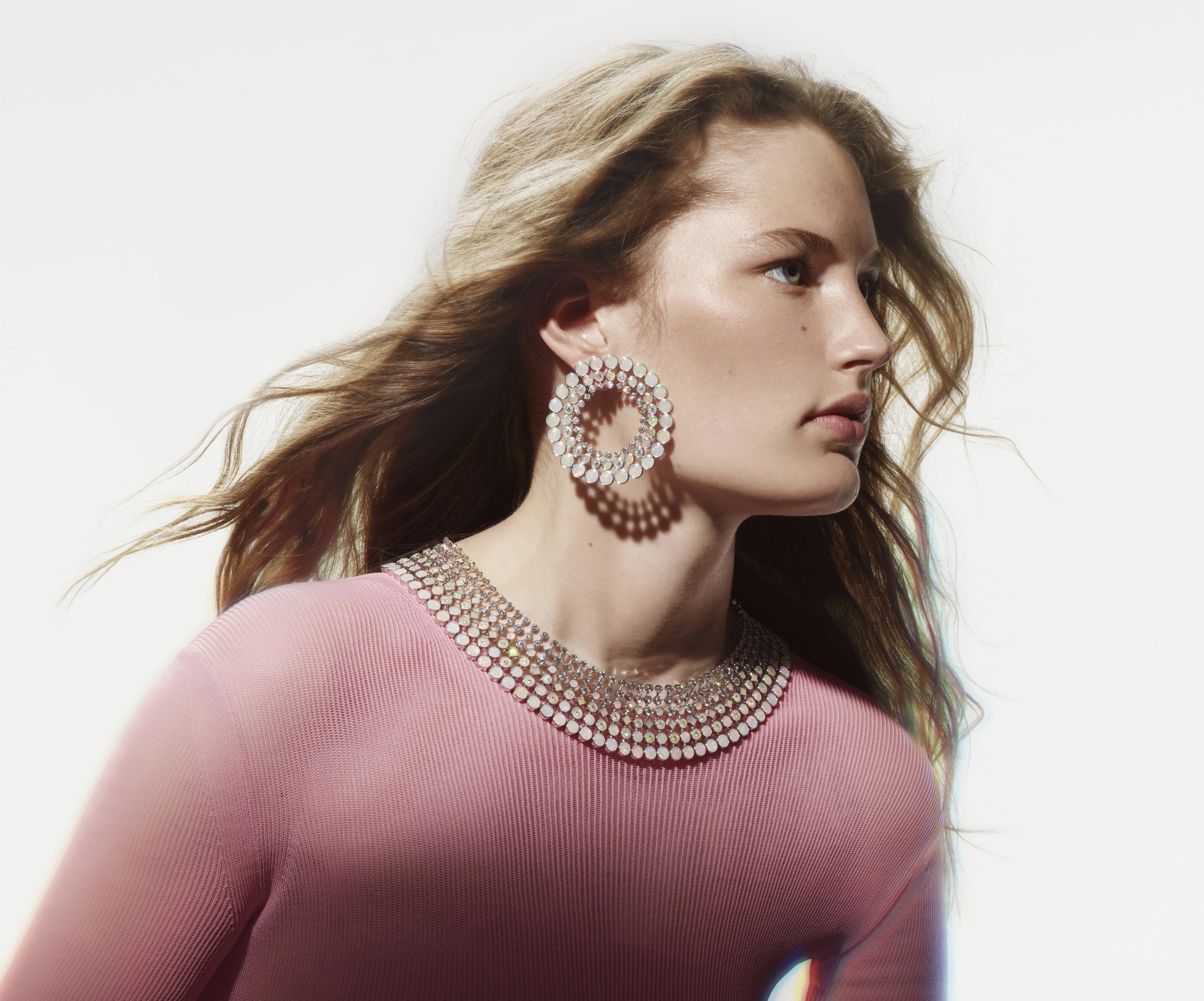
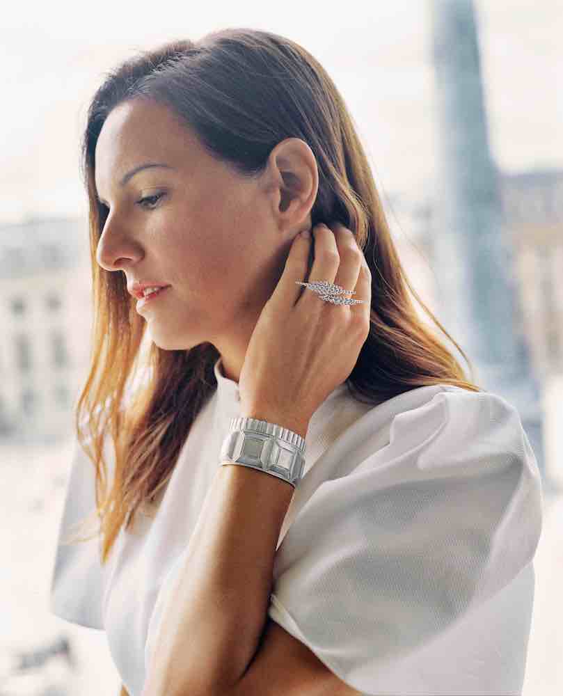
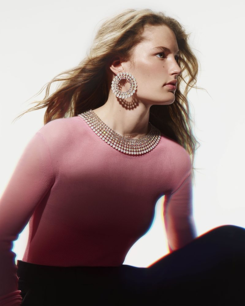
With Boucheron’s latest “Carte Blanche” high jewelry collection, creative director Claire Choisne set out to capture the entire spectrum of color, finding her solution in the possibilities of light. The result is “Holographique,” a suite of 25 new necklaces, brooches, bracelets, rings, and earrings within nine sets.
To capture all the potential brilliance of light and its refracted rainbow of color, Choisne and Boucheron both looked to the holographic effect in nature found in opals and arrived at a surprising high-tech spraying process created in collaboration with the French industrial manufacturer Saint-Gobain. When applied to rock crystal and ceramic at high temperatures, the technique re-creates the natural holographic phenomenon.
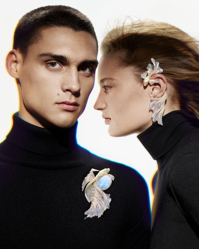
In the collection, a dazzling opal is wrapped by a betta fish swimming against a sea of iridescent opal beads. Peonies and pansies shimmer in the light, reflecting like the surface of water. A fan of futuristic feathers makes up a necklace in rock crystal and diamonds that radiates the rainbow.
Whitewall spoke with Choisne about exploring the potential of movement, color, and light with the historic jewelry maison.

Portrait of Claire Choisne courtesy of Boucheron.
WHITEWALL: How did you arrive at light as the theme for this collection?
CLAIRE CHOISNE: In fact, light was the solution. In the beginning, my purpose was more about color. When you think of the Boucheron archive, color is part of Boucheron’s DNA. But for the 10 years that I’ve been at Boucheron, I didn’t find yet a way to express colors in this new way. I didn’t want to do a collection that you’ve already seen. So I found the solution in light, and this link between light and colors—the refraction of light and this holographic effect.
Usually, you see colors with stone colors, but I wanted to have all the colors on all the pieces. So, a holographic effect was a good way to achieve that.
WW: How did you find this really industrial technique of getting to that holographic effect?
CC: I have great teams that work with me. We have an innovation team at Boucheron, so I spoke to them, and I explained the concept and what I wanted to express through this collection. They started looking at how to achieve that and they found Saint-Gobain.
Saint-Gobain had never worked at all for jewelry. It was quite strange at the beginning, as they are engineers and we are not, but we found a way to work together and achieve the collection. It was great.
WW: How did this technique then influence the look and feel of the collection, the overall design?
CC: At the beginning, I thought that this holographic effect would be always the same—lots of color, but quite the same effect. We found that no, it wasn’t true. We put 10 layers of coating on each piece, and thanks to those 10 layers, you can change the final aspect of the coating. So we succeeded to create a gradation of intensity through the collection. Some pieces are quite soft with color, and in others you have a lot more.
WW: How did that relate to the choice of using opals?
CC: I split the collection in two. At the beginning I knew we would start with opals to express that you can find holographic effects in nature, and then, the in second part of the collection we’d re-create this holographic effect.
Boucheron’s Opalescence brooch set with set with a 71.69 ct oval cabochon white opal from Ethiopia, and earring set with opals and diamonds with lacquer, in pink gold.
WW: There’s this balance in the collection between the beauty of nature and then these super futuristic designs. How did you move between the two?
CC: It was also like a gradation of purity. We start the betta fish and flowers in the beginning of the collection. It’s something important for us because at Boucheron we work a lot around the theme of nature. But I also love the purity of quite contemporary design. That’s why you find both.
WW: The collection feels quite joyful. What emotions did you want to capture?
CC: It was one of my first goals. I always start with what I want to say, what I want to express. I knew that it was color, but why? And why, it’s because I think that color brings you joy and wonder and it’s always positive. So if you have this feeling, that’s perfect, that was the point.
WW: How were artist Olafur Eliasson and architect Luis Barragán
sources of inspiration for this collection?
CC: I think the first source of inspiration most instinctively was nature, with the natural phenomena of rainbows, Northern Lights. But after that, when I went deeper in the subject, I remembered the work of Olafur Eliasson, the link between light and colors. I had the chance to go to see an exhibit when I worked on this collection, and I remember the feeling that I had watching was that color can really create emotion. It’s not only aesthetic—you feel something. We tried to reproduce a little bit this kind of feeling.
I love as well the architect Luis Barragán. He was born in 1902, and I had a chance to see his work in Mexico and spent some time with a man who worked with him a long time ago who explained this link between light and colors. It’s so modern, so pop, and so cool. You can feel as well the joy in this kid of architecture. That was a great source of inspiration.
WW: From designing collection to collection, is it a continuation or do you start fresh? How do you like to work?
CC: After 10 years, I can now see that there is something that links all the collections. Your ideas don’t stop there and start again. It’s a continuity. And high jewelry is really about a big timescale. It’s not the past and present; it’s a continuity. It’s really about finding something new to say and express, new creativity, but at the same time, to be sure to have a link with our archive, our history.
Boucheron’s Ondes necklace and earrings, set with opals, mother-of-pearl and diamonds, in white gold.