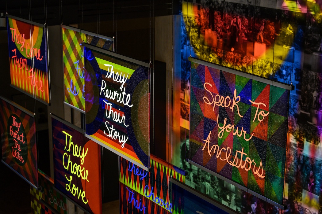
This fall, at the Venice Biennale, Swatch exhibited new work by the artist Sigrid Calon showcasing her collaboration with photographer Willem van Zoetendaa, where her signature patterns were overlaid onto portraits, printed onto hanging textiles.
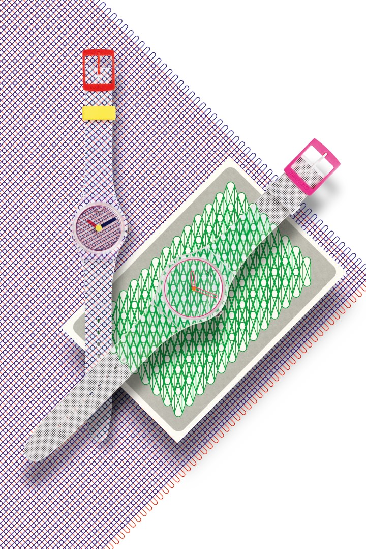
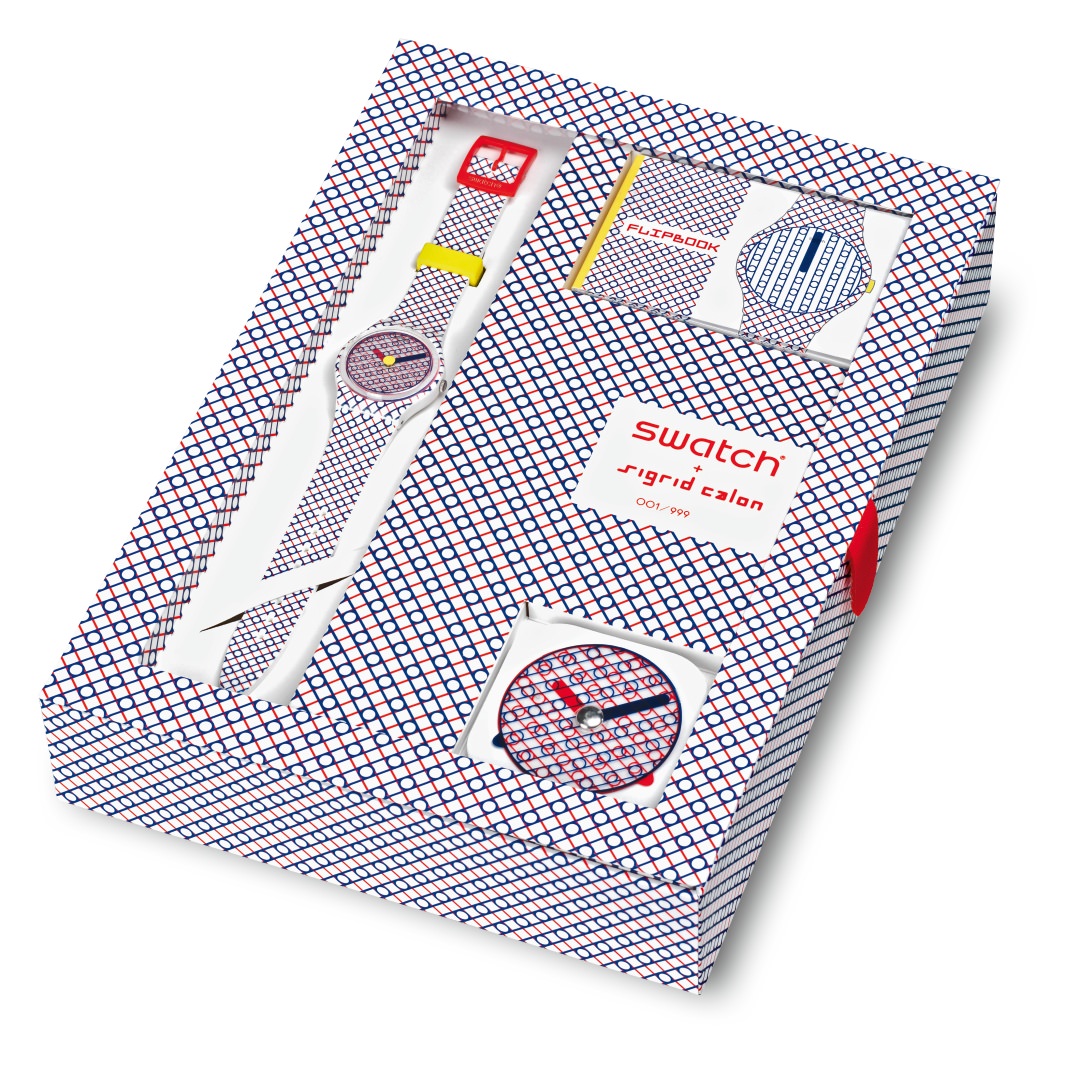
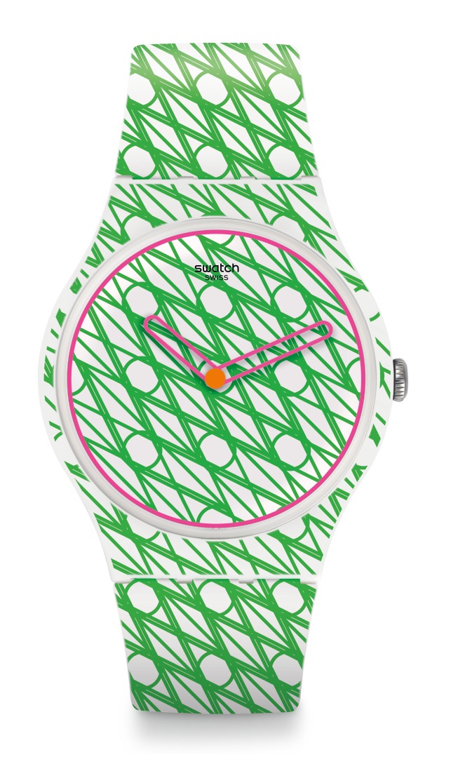
The exhibition of new work coincided with the release of two watches she created for Swatch Art Specials: Duet in Blue and Red and Duet in Green and Pink. Whitewall spoke with Calon about her practice, including risographic printing, and about first foray into designing watches.
Sigrid Calon for Swatch
WHITEWALL: What about patterns, geometries, and grids, continue to interest you in your work?
SIGRID CALON: I think it’s my way to create some order out of the chaos. I feel most like myself when I express myself in a clear and fresh way.
Sigrid Calon for Swatch
WW: When did you first start working with risographic printing? What did you want to achieve?
SC: I made my risograph-book (To the extend of / | & – ) in 2012. It was my first book and also my first experience making my own riso’s. The reason I wanted to make a book is because that seemed the best way of putting a lot of works together. In the riso I found the perfect way of expressing it in a sensitive and powerful way. Its way more intense than digital printing and it has very bright colors.
Sigrid Calon for Swatch
WW: How important is color choice when working with graphic patterns? Are there certain colors you would never use next to each other? Or likewise, certain patterns.
SC: Colors and color choice is very important. It seems simple, but I think combining the right colors can make a huge difference. It’s so much fun to play with it and try new things. The book contains 120 compositions, made out of eight different colors combining two, three or four colors at maximum. For the index, I made a schedule and each of the 112 different color combinations is a page. Some of the color combinations aren’t my favorite, but I had to use them because the concept asked for it. So it was absolutely a challenge for me to make something beautiful and attractive out of it. Same with forms and patterns.
Sigrid Calon for Swatch
WW: We saw that embroidery is also a source of inspiration for you – any specific embroidery?
SC: No, not any specific embroidery. I am fascinated by textiles techniques in general. For the embroidery-works I was just so surprised by the power and beauty of some simple stitches. So I was trying to explore the possibilities of that by enlarging the stitches and the use of other materials. When working on the computer, the stitches became lines and so I developed my own visual-language.

Sigrid Calon for Swatch
WW: How were you approached by Swatch for this project? What was the brief?
SC: A swatch representative saw my work at an art book fair in Milan and she contacted me for a commission. Before they asked me for the watch, I did some prints, a spread for their magazine and an art collaboration for the Water Tank Project in New York. They were so enthusiastic each time that they decided to ask me for a watch design. The briefing was think Swatch—fresh, strong, colorful, etc.

Sigrid Calon for Swatch
WW: Had you worked before on watch or was this your first time? If it was your first, what were some of the challenges of working with creating a watch?
SC: I’ve never, ever thought of designing a watch! But it was such an honor and so wonderful working on it! My challenge was making choices. I could have designed a whole collection! So I had to pick the best one.
A collaboration between MB&F and L’Epée 1839, Sherman is the robot companion that MB&F founder Maximilian Büsser always wanted.
WW: You worked with the Swatch team to create a disk on the face of the watch that would move, as well, so the pattern would continually change as the minutes went by. What sort of affect does that have on the patterns you created?
SC: I was also challenged and fascinated by the idea of time. In a way I felt a bit disappointed by the fact that a watch is always the same, while time is constantly changing. It triggered me to create something to see time changing. So I came up with the idea to use two printed disks, instead of two hands, to show the time.
A collaboration between MB&F and L’Epée 1839, Sherman is the robot companion that MB&F founder Maximilian Büsser always wanted.
One disk has a blue grid (for the minutes) and the other has a red grid (for the hours.) The blue one is moving faster than the red one, that means that every minute is a bit different and every hour the disks are exactly the same. It’s a simple idea, but it wasn’t done before by anyone else!
WW: What did you want to do with the hands of the watches?
SC: I used these special disks instead of hands for the watch Duet in Blue and Red (edition 999). Duet in Green and Pink is made with ‘normal’ moving hands, but I wanted them to have this typical shape; the same as my graphic embroidery-stiches.
WW: Is there anything from this collaboration with Swatch you would bring into your own studio practice?
SC: I am very happy with the concept of the turning disks. I think it’s something that deserves more attention, so hopefully I can use it again in another project.

