Kris Van Assche’s tenure at Dior Homme has coincided with a tidal wave of attention and new brands devoted to menswear. Within a market on the brink of oversaturation, though, van Assche has kept Dior Homme a leader and lightning rod in men’s fashion, carving out a distinct voice for a historic house.
On the eve of his tenth year as creative director, Whitewall spoke with Van Assche about testing the limits of the label and experimenting with a unique urban language he’s employed to create looks like his signature skater suit and efforts to reintroduce florals into men’s fashion.
Van Assche also shared with us how he started collaborating with the ceramicist Kristin McKirdy, an encounter that came out of his growing collection of midcentury French porcelain. We learned that art has always a part of his life, while he was growing up in Antwerp and now in Paris.
WHITEWALL: You’ve now been creative director at Dior Home for nine years. Is there a significance for you in reaching a decade with the fashion house?
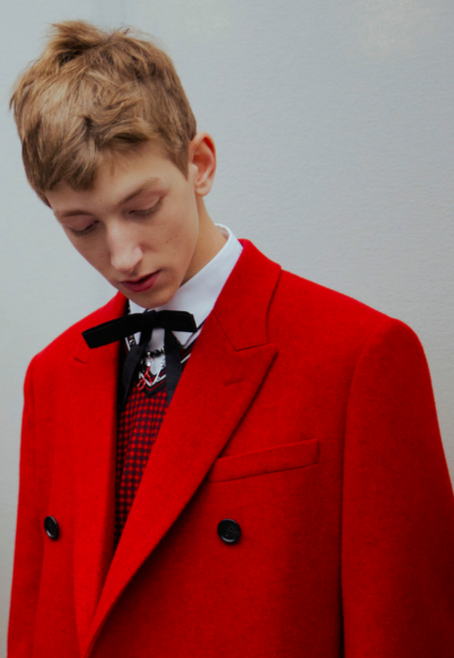 Photo by Virginia Arcaro
KRIS VAN ASSCHE: A decade is exciting for me, but I don’t necessarily feel nostalgic. It’s more a time to take stock and be thankful to everyone who has supported me for so long, and a chance to evolve what I have been doing at Dior Homme with an even more confident fashion message. Of course, it is a moment of celebration, too!
WHITEWALL: You’ve said how defining what Dior Homme is was the initial focus for you when you came on in 2007 as creative director. Now that that’s been successfully established, how has your focus changed?
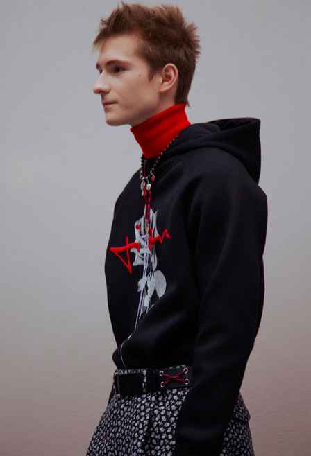 Photo by Virginia Arcaro
KVA: We have worked very hard to create a foundation for the Dior Homme wardrobe, to rebuild and reinforce the heritage details and the classic elegance of the house. With that so strongly in place, I can now progress further and test the limits of the fashion collection—taking it in new directions, experimenting with my own urban language in more complex ways.
WW: Your time at Dior Homme has coincided with a real sea change in attention to menswear. What do you think of the increase in attention to men’s fashion? Are there pitfalls to such an exponential expansion of the market?
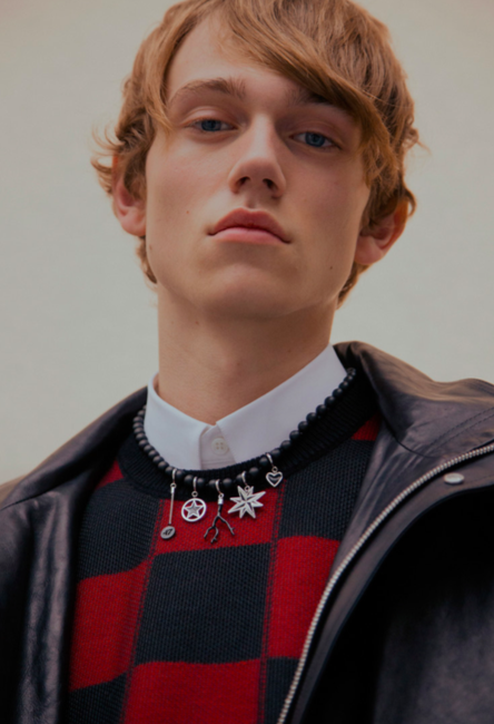 Photo by Virginia Arcaro
KVA: Menswear has never been more potent or visible, and that is an exciting thing as it encourages guys everywhere to pay more attention to their own sense of style. Perhaps it means they will take a chance with a new silhouette, try an innovative material, or mix and match from their wardrobe in a more modern way. The only negative to this expansion of the menswear market is the saturation of similar brands and aesthetics—but it just makes me strive to ensure that Dior Homme stands out even more as a pillar of iconic menswear.
WW: You put your eponymous collection on hold last year. How has that affected your creative process at Dior Homme? Do you feel a bit freer to show more of your personality in the collections?
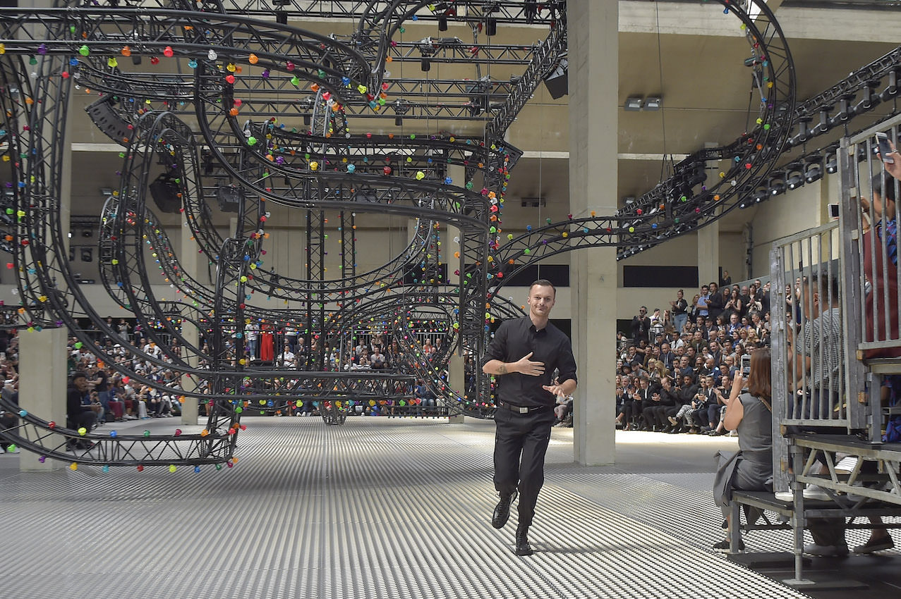 Photo by Patrice Stable
KVA: Putting the Kris Van Assche label on hold was a personal decision that has allowed me to refocus my energy into a single project. I do indeed feel freer to inject more of the urban and sportswear references of my own label into Dior Homme—it has been a natural progression to reveal that side of me season by season without feeling labored or forced.
WW: What made you ultimately feel confident enough to reference Mr. Dior, however conceptually?
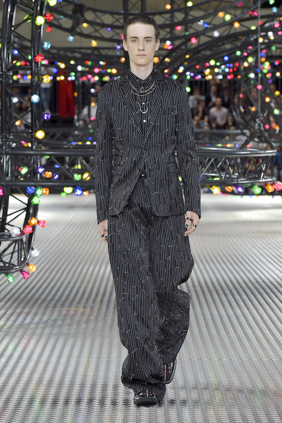 Photo by Patrice Stable
KVA: I think that his spirit has always been present in my collections for Dior Homme in one way or another, from the very first formalwear through to my more recent literal homage. In the past few seasons I explored some of the very few existing links that could be drawn between Mr. Dior himself and menswear, considering he never designed any himself. Instead, I took elements like his handwriting and his signature, his favorite flowers, and his sense of bourgeoisie, and I twisted them into something new.
WW: Lately, you’ve been introducing some floral imagery and patterns, like the lily of the valley (a historical Dior reference) in 2014 and in the fall/Winter 2016–17 collection several different rose patterns. Can you talk about a bit about introducing floral patterns into menswear, especially in the most recent collection?
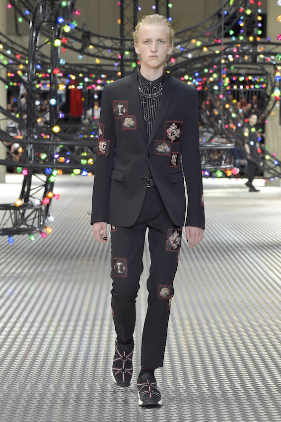 Photo by Patrice Stable
KVA: Men have been wearing florals for centuries, so for me it was more about how to make that a relevant statement for today. I have always personally been inspired by flowers myself, right from my very first Kris Van Assche collections. Of course, the lily of the valley or muguet was Mr. Dior’s favorite flower, which I interpreted as an embroidered corsage and appliqué across pinstripe suiting for Fall 2015. A season later I created the white rose badges as one of my symbols of the Parisian boy and his mash-up of bourgeois and streetwear, and for Fall 2017 that became a darker, New Romantic symbol as intarsia knitwear and a black-and-white photo print.
WW: The Fall/Winter 2016–17 collection was named “The Art of Falling Apart.” Can you tell us about that title?
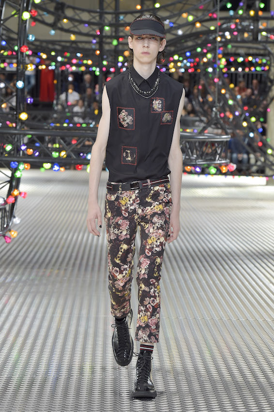 Photo by Patrice Stable
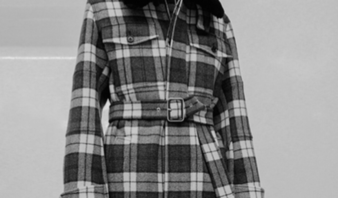
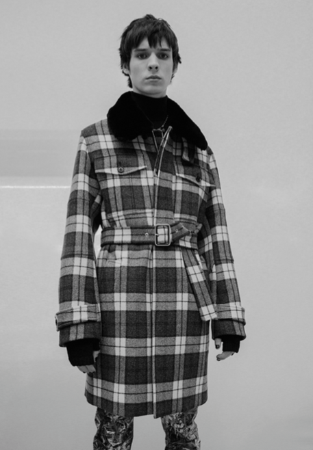
KVA: “The Art of Falling Apart” was my way of playing with deconstruction and formality—how to take the sartorial traditions of Dior Homme and give them a rough edge. It explains the scarlike red topstitching down overcoats and lapels, the fringed checkerboard embroidery, and the frayed, repaired skinny denim. It is also a reference to the skate universe.
WW: We noticed some exposed, frayed stitching, wider-legged pants, lots of leather, and a beaded necklace with several charms. Can you tell us about some of the details in the collection?
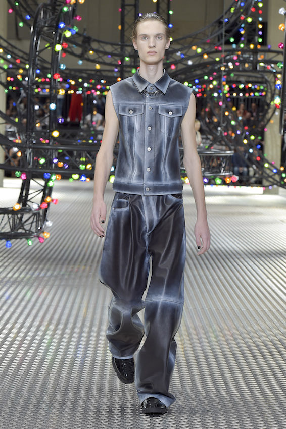 Photo by Patrice Stable
KVA: This collection definitely called upon a more rough-and-ready streetwear element that collides with my idea of the Dior Homme archetypal wardrobe. That allowed for exciting contrasts of fabrication and silhouette, from, say, the opulence of a short parka cut in glossy calf hair to the ease of tailored pants finished with a jogging cuff, waistband, and red-laced drawstring. I played with a clash of checks, stripes, and the rose print to bring a sense of chaos to the perfectly executed garments.
WW: Was there any one look or garment that felt really wild for you?
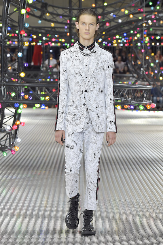 Photo by Patrice Stable
KVA: One of the most important silhouettes in the show was the slim jacket with a wide, baggy pant. It appeared in various materials, but for me I was excited to show it in black leather. Perhaps it wasn’t the flashiest outfit in the show, but for me it distilled the message of my “skater suit” in the most coherent way.
WW: In the Spring 2016 show models wore or carried a talisman made by ceramicist Kristin McKirdy. How did you first come across Kristin’s work and why did you want to work with her on a talisman for the collection?
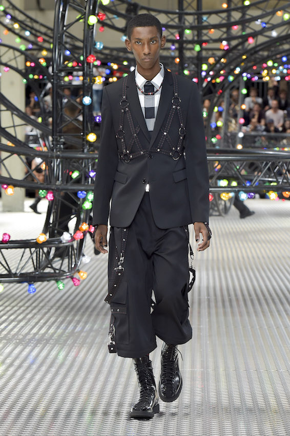 Photo by Patrice Stable
KVA: I am a fan and a collector of midcentury French porcelain, and I discovered Kristin’s work in one of my favorite galleries in Paris. It was a pleasant surprise for me to find someone with her aesthetic sensibility who was still working today, and in Paris, even—so it felt natural to approach her to collaborate on a wearable version of her creations.
WW: You’ve said before that menswear is about codes (Wall Street, weekend, skater, punk, sportswear, bourgeois) and that you reinterpret, rethink, and oppose those codes to create something new. The Spring 2017 show is coming up later this month, and we saw on your Instagram a hint at it with a black basketball with blue bedazzled lines. While perhaps you can’t share much about the line, what kind of codes are you playing around with this season?
KVA: For Spring 2017, the collection is an evolution of Fall’s rebellious youth, but channeled through the landscape of a Belgian fun fair in the late afternoon light. It’s an exploration of the kind of industrial, post-punk attitude of the guys that hang out there, and the way they mix sportswear with denim, patches, and other symbols of belonging.
WW: We also noticed on Instagram you post pictures of art (alongside your cat Diego!), by artists like Katrien De Blauwer, Glenn Ligon, Robert Longo, Robert Mapplethorpe, Robert Irwin, et cetera. We read that you were very into fashion early on, via magazines. How did you interest in contemporary art come about?
KVA: Contemporary art was something that became a part of my life as I grew up and left the Belgian countryside to discover Antwerp and Paris and the rich art scene in both cities. The more I have traveled, the more opportunities I have had to see exhibitions and meet contemporary artists in all the major capitals, as well as feed my own thirst for knowledge by looking into the past to find certain schools of art practice that inform my design work today.
WW: Are there any artists or mediums you are particularly drawn to?
KVA: I would say that I am quite traditional in the sense that I love painting, photography, and sculpture—even though I have the chance to work on short films as well with Willy Vanderperre for our Dior Homme campaigns, which is an exciting medium as well. I do have an affinity for certain Belgian artists, although there is a great wealth of talent from across the globe that I touch upon when I visit art fairs and shows.
WW: Do you have pieces in your home or studio space that serve as a source of inspiration for you?
KVA: Last year I purchased an older piece from the New York artist Dan Witz—a painting in a pentagonal frame featuring a dark hooded figure, black on black. I like the contrast of darker works like that against Kirsten McKirdy’s colorful, brutal ceramics, but both have that feeling of a rough edge that I am always drawn to.
This article appears in Whitewall‘s fall 2016 Fashion Issue.
